Tuesday 25 November 2014

Responding from what I learnt during Review week.

Putting together the presentation for last weeks review helped me to see which parts of my practice I enjoyed the most, and made me realise what I need to do before the end of the project. This week I have therefore been doing more development drawings based on the work I have done so far.

The anatomy part of my project has really inspired me ever since I did it, and I also enjoyed producing more abstract work a few weeks ago so I decided to mix the two together. I therefore produced abstract paintings of the cross sections of my own flowers. Overall I didn't like the paintings as I felt they looked childish, but when photographing sections of my work, I realised that they became more abstract and more focus was on the marks an brush strokes rather than the overall painting.


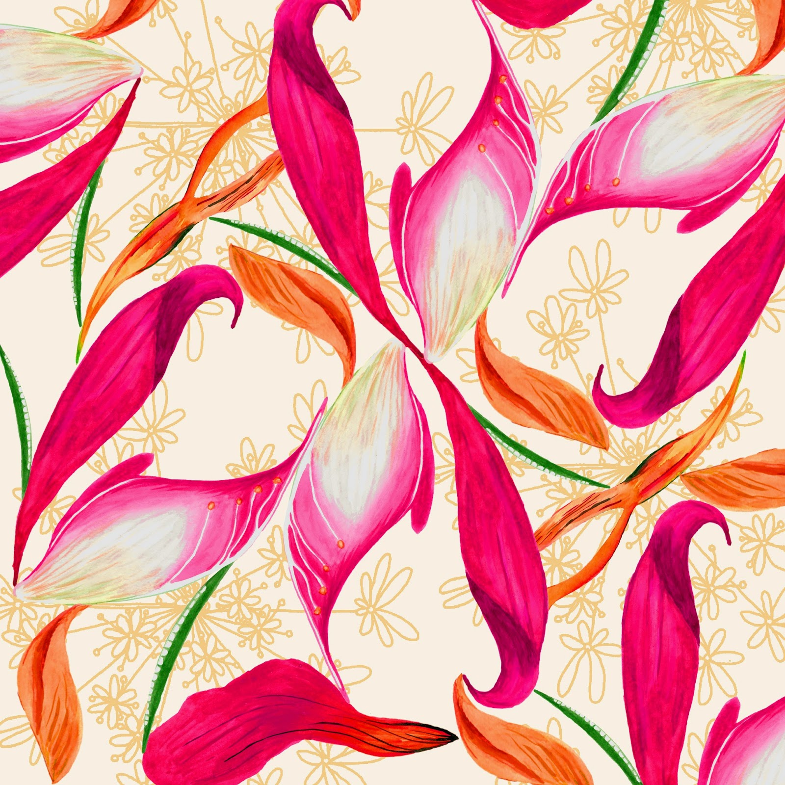
I also thought that my prints were working well, and the idea of creating a print out of lots of elements from one flower worked well along side my learning agreement. I therefore created new work based on a Lily, using the parts to make marks, drawing it, and using the pollen to paint with.


When painting with pollen, I added a little water to make it a liquid but it turned into a really sticky substance that ruined everything that I was using, and was really hard to work with. I think the idea of using pollen could develop further into possibly printing techniques such as screen printing. However I will need to try it out when mixing with manutex, as it might not work at all. This might be a task for after Christmas or in Unit X. I also intend to make these into prints made from just Lily's.

The review also made me realise that I need to try different compositions for my prints, possibly linking them more to the research I completed at the start of the project.

Tuesday 18 November 2014

Review Week

This week was review week, and we had to present our work so far in powerpoint form to two tutors and a group of our peers. I used the opportunity to reflect on the work I have done so far and see what parts of my work need more research or more development.

A key part of the presentation was establishing our context. My work for this project is for a surface pattern context, and I am considering four main product areas; wallpaper, stationery, giftware, and soft furnishings. At the moment I can see these dividing into two collections, of a larger scale and smaller scale. The decision to do this has been inspired by my two placements at Tigerprint and Digetex, as well as some key contextual influences.

Rachael Taylor is a surface pattern designer who designs for a large range of products including lamp shades, duvets, throws, cushions and wallpaper. As well as being inspired by her work contextually, I also love her drawing style as it stays hand drawn and quirky.

(Images from Rachael Taylor Designs)

As well as being inspired by designer makers, larger companies like Paperchase also inspire my practice as they have ranges of patterns that are produced across a variety of products such as gift wrap and stationery.

(Images from Paperchase.com)

Compared to Rachael Taylor, they have much lower prices as they are a high street brand. At the moment I am not sure whether my work will be aimed at high end or high street products

As well as examining my context, I also visited a Close up Exhibition at MOSI. It consisted of microscopic images of natural forms which I thought would give a good twist on the work I am doing at the moment.

Image from Come Closer Exhibiton

The geometric nature of these images lead me to think about butterfly wings, and other geometric shapes found within nature. I therefore gathered some first hand research at a zoo and completed some drawings of the patterns, with the intension to mix these patterns with some watercolour based paintings at a later date.


Tuesday 11 November 2014

Design Experimentation and Development


For me, this week was all about developing the drawings I have been doing into ideas and designs. Sometimes this was just placing different elements together to see what they looked like, and some developed into design ideas.

I started off by defining my colour palette which is inspired by natural and scientific elements, as well as colours that I like. I have enjoyed working with the colour palette but to improve it, I feel that I need two different palettes or colour directions for me to experiment with (such as bright and tonal). I will bare this in mind when working on drawings and designs in the future.
Colour Palette Development

I started by experimenting with some of the large scale shadow drawings that I have completed, and I like the design below as there is a good contrast between line and shadow. I also like the fact that it involves the shadow and contour line drawing of the same plant, so both elements have come from the same source yet look totally different. However, I after using the larger scale shadow work in my designs, I dont feel it does justice to my concept and the ideas I have had throughout the project. I therefore might use the data ring idea with other elements to make a stronger print: the larger scale work might be something I could pick up again in Unit X.

Shadow and contour line print experiment

I also mixed up some painted elements to create a traditional style print with a modern twist. I like how each element works well together, with the paler silhouette in the background, and the bold flowers. I think if I created more similar, but smaller motifs, they would all make a good repeat pattern too.

Experiment with gouache flowers

I also wanted to keep some prints simpler, using just a few colours, and I am pleased with the print below. I like that this print represents the taxonomy, and data collection part of my project, as all of the elements were collected on the same walk. I think I could experiment more with the way I arrange these, possibly bringing in the botany element from my work so far. 

Print based on collection of natural elements

Finally, I also like these two prints below because I feel that they are starting to become more original and different to whats already out there. I feel that the mix of hand drawn, graphic, textural and solid colour work well together and I wish to develop this with my next set of designs too.


I am really pleased with my design development and I feel that this will now help me to focus my drawings as I know the kind of designs I want to create. 

Tuesday 4 November 2014

Tree ring data and going even bigger!

This week my main focus was to go even bigger scale than I did the week before with my shadow drawings.

I created paper that was up to 1.5 metres by 1.5 metres and pinned them up on the wall for me to draw on. The way I chose what I was drawing linked back to my original brief based on data collection, as I went and collected 5 objects from my garden that had 2 colours in the leaves. Using these I then created my own experiments in 10 minutes using a variety of tools and media.

I am not sure whether I like the results as I feel the paintings look rushed and bad quality rather than loose. However my favourite painting is the one below, because I like the way the two colours of paint mixed whilst I was painting.

Large scale shadow painting experiment.

Another task I set myself this week was to look at ways that data is found and recorded in nature. I came across tree rings which hold a variety of data for each half year of a trees life, meaning scientists can look back into the past to find out what weather conditions, and various other factors, were like years ago. After doing tree ring drawings I decided to make concentric circles inside and outside of the outline of a plant. I thought these were effective and have the potential to be part of a design.

Concentric tree ring data drawings

I then combined these two ideas: paint mixing on the surface, and tree ring data. I also wanted to illustrate both the inside and outside of a tree, so used the mixed paint to represent bark patterns, and added the line to illustrate the tree rings on the inside.

Tree ring, bark and mixing paint.

I felt that this small painting was quite successful as it got across both elements and I like the contrast between line and mixed paint. I have also realised that I am at the stage where I need to establish a few colour palettes to work with so that I can start to develop my work with colour. However, I feel that this style of work wouldn't suit my target market based on the research I have done, so this more abstract style might be something that I could pick up on in Unit X.

This week has also shown me that I should look over my learning agreement again. I stated that I wanted to look into science and nature, but now I have realised that it is data, rather than science, that I am interested in investigating. I intend to edit this next week.