Friday 22 November 2013

Unit Review.

Whilst I have really enjoyed this project, it has really challenged my working methods and pushed my practice into completely new directions. It was very frustrating at times but I am so glad that I persisted and continued to see how far out of my comfort zone I could go, as it has really developed my practice. I chose a brief that would challenge me, I used new processes for research methods (when trying to represent sound) and idea development (such as photoshop which I have barely used before), and allowed the project to guide me on a journey. I was so far out of my comfort zone that for the middle of the project I was lost, to the point where I had no idea what to do, where to go next, or how to regain control. But due to insightful tutorials and self motivation, I managed to steer my project into a more focused direction and I am really proud that I did this, as my final outcome is so different to anything I have produced before. 


This project has also allowed me to create designs for a specific target audience which I have really enjoyed. Rather than designing with no end use, having a purpose for my designs has allowed me to think about practicality and whether my designs would look good and be achievable for the market I am aiming them at. Looking at other practitioners such as Maxalot has really helped and inspired this process for me. 


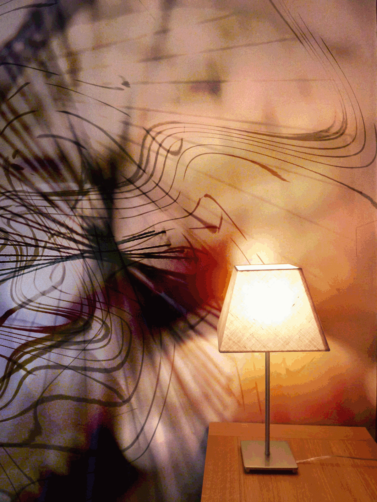
I have also discovered a new way of working throughout this project that I will continue to use in my practice as I feel it has enhanced my work. When getting stuck or being in need of inspiration, I have been putting ideas, drawings and processes together, such as my digital print designs with my 3D stitch. Although this wasn't always successful, when it did work, I loved the results, and this is actually how my final designs were developed; mixing my 3D stitch work with photography and photoshop.


The challenges that I faced in this project have definitely developed me as an artist and I feel like the frustrations that I experienced were worth the qualities that I have gained. 

Context images

All of the designs in my final collection need a context image for assessment, so I made 2 images that I thought I could see my designs being placed in. On illustrator I drew a Foyer and a Bedroom, one with a whole wall being covered, and the other had just a panel to show 2 different ways my designs could be used. Below are a few examples.


At one point I was considering making fabrics for large lampshades, but I decided when drawing my context images, that my designs suited much larger scale panels and wallpapers much better. I therefore decided to just concentrate on these two for my final designs.


Wednesday 20 November 2013

My Final Collection

Here are the 10 digital prints that I have chosen for my final collection. I decided to add 2 more in after I thought I had chosen my final 8 because I think they add other elements and motifs that make my collection more diverse. I am really happy with the results, especially how well the colours all link together. (please click to enlarge).


The next and final stage for me, is drawing some more interior settings to put my images into context; large scale wall papers and panels.

Saturday 16 November 2013

Pin up/Review of final design ideas.

This week I have created over 40 photoshop samples, and one of the hardest decisions I have had to make in the project has been choosing a selection for my final collection of samples. I decided on these 8 and thought that pinning them up would help me see how well they worked as a collection. 


I started to notice certain aspects of the designs that I thought could be improved, such as the colours on the second design down from the left which could be more sepia rather than grey. I am also considering whether I like the first design as much as I thought. I like the fact that there is a distinctive shape in the design unlike the other ones, but I don't know if that makes it stand out too much as not fitting in with the collection.

I am going to see what improvements I can make to the designs, and take these to my next tutorial along with some other successful designs to review whether I have made the right choices for my collection.

Friday 15 November 2013

Placing designs on my own drawings

When putting my designs into context last week, I realised that the most successful ones were large scale, so I have decided to try drawing some scenes to place my designs, as I can't take photos of such big spaces. I started off with 2 different drawings to see what the results looked like, so I could go back and do some more when I knew what worked best.


I feel like the hotel foyer drawings gave the best results. I loved the scale and the incorporation of light even though I found this really hard to get across)


I thought my large lamp shade worked well, but compared to my other examples placed on photos, I found it hard to represent the natural glow that I thought worked really well.


Thursday 14 November 2013

Context: Who wants my designs?

Last week, I came to the conclusion that I wanted my designs to be used for large wall papers and large lamp shades, and after doing some more research I have decided that my audience is going to be businesses such as hotels and restaurants. 


This is because they have the space to accommodate the products I am offering, and usually have large high walls and space for large lamp shades. 


I envisage my designs being on large feature walls in restaurants and hotel foyers.


 As a lot of my prints are dark, I also feel that the dark environment in a Bar or Restaurant at night would bring my prints to life, with artificial lights enhancing the glow that is present in my prints.


As light adds a lot to my designs, I am considering making lights part of the designs, such as Jonas Samson does (refer to post below). I need to consider how I might do this, whether the lights would be part of the design or whether any artificial lighting that was used to light the space would be fine.


Monday 11 November 2013

Incorporating Light back into my designs.

When placing my designs onto lamp shades, I love the glowing quality that is put back into my designs,  just like when I took the original photos. I want to try and create this effect on the wallpapers too so have done a bit of research into how I could go about doing this.

Jonas Samson

Jonas Samson creates light emitting wallpapers with built in LED lights that can be turned on and off, which could be one direction I could consider going in; adding hints of light where relevant.


Meystyle LED Wallpaper

Meystyle also use LED lighting for their wallpapers but in a  slightly different way. They use highlights of lighting rather than lighting up the whole design.


When relating this to my designs, I could light up the whole design to give it a glowing effect, or just add lights to highlights that look glowing, to emphasise this quality.

Group Tutorial: 11th November 2013

I went to this weeks tutorial with a good idea of what I wanted to produce as my final set of samples, as well as an idea of where I want to place my designs. I am finally feeling like I am almost there, and that I am on the right track. My tutorial was very useful and I have decided that for this week I am going to keep developing more digital work, with an aim to produce a few more samples that I can select my final designs from, to take these to my tutorial next week.

Whilst making designs for my final collection I am going to keep the following points in mind:

  • Make sure that there is variety, and that the range of samples don't look too 'samey'. 
  • Ensure that the colours of my samples work well together as a collection; at the moment I think are working quite well.
  • Keep some simple!

This week I also need to take more photos to place my designs onto, of large walls and lamp shades. As this might be quite hard, I have considered drawing scenes instead.

Putting my designs into context

After I had chosen some of the designs I was most happy with, I wanted to place them onto some products so I could see if they were working in the way I wanted them to. I started by taking some pictures of products I could place my designs on, and then I edited them on in photoshop.


From the above experiments, I found that my prints haven't come across in the way that I wanted them to. The cushion dulled the colours and didn't have any vibrance to it, unlike on the harder surface of a lamp, because the light emphasises the glowing qualities of the prints. However I didn't think the small scale of the prints worked as well, so I am going to consider placing my designs onto very large lamps, such as those found in restaurants.

 I really started to like these experiments below, as the light made the print glow, just like the original photos that I took on my camera with my stitch experiments.


 As I like the large scale of these, I think they could go even bigger. I am going to do some drawings to scan into photoshop to see how far I can push the scale. As I do this, I might need to add detail into some areas so that when people view it close up, it still has detail and focal points.

Sunday 10 November 2013

Developing Digital Designs

This week my main focus was to create a set of digital designs that could possibly be used as a final set of outcomes for this project. I have used photos from lots of different 3D and light experiments that I have previously created.


I also made a squiggly brush motif from a picture of slack thread that I had taken in a previous experiment.


I produced over 30 samples this week, but here are some of the ones which I think worked best. I think I was happy with them because of the colour, line quality and composition. I also liked how in some of them, a glowing effect started to occur which I thought might suit a lampshade.


As an experiment I also incorporated some of my earlier drawings and sketchbook ideas into my designs, shown below. This included watercolour, my fingerprint experiments, and a selection of audacity drawings.


The next stage for me is to look into the context of my work, and place my designs onto photos in photoshop.

Thursday 7 November 2013

Pin up/Review

One of the things that Alex recommended we did this week was to do a Pin up of our work. As most of my work is in a sketchbook, this just involved printing out a selection of my digital work and carefully reviewing my sketchbook, to see if there are any ideas that I want to pick back up again, that I might have forgotten about. I wanted to be sure that I have done justice to all of my ideas.

I feel as though there is a lot of content in my sketchbook, such as some of my original drawings, that no longer have a place in my project. I enjoyed doing it, and it took me on a great journey which took me to the place I am at now. However, it is no longer relevant to a lot of the digital designs that I am creating at the moment. On the other hand, some drawings, shapes and textures that I did in my visual research could easily be put back into my designs to add texture and shape, so I might experiment with this this week.

Overall, although I haven't carried forward some ideas from my visual research, I feel like they helped me on my journey through the project and good decision making allowed me to be at the place I am at now. Although some ideas weren't used this time, they developed me as an artist and I could pick them up again in another relevant project.

Investigating my market.

This week I am focusing my attention on where I want my final digital designs to fit into the current market. I decided in the tutorial that I wanted to make prints for interiors, so I have considered designing for large wall murals or panels,  as well as objects like cushions and lampshades. Below are some examples and artists that have given me some ideas and inspiration.

Maxalot

Maxalot are a wallpaper company that create large scale artworks for interiors. I love their use of scale and colour, and their work has really inspired me to think about designing for wall art of some form.


This dark design based on galaxies reminded me of the designs I am doing at the moment because they're dark and have brown/orange tones.


Digitex Wallpapers

Like Maxalot, Digitex Wallpapers create large scale images for wallpapers that aren't in repeat but are a  design in themselves. This is the kind of idea that I want to reflect in my work too.


Wall Panels

I also feel that wall panels might be a good option for my designs. I have thought about splitting my design into 2 onto 2 canvases, to bring in the element of 2 parts that is in Piano Phase (created by the 2 pianos).


Lamp Shades

Another interior item that I have considered designing for is lamp shades. When I have been taking the photos that I am using for my prints, I have used the holes in the paper to let through light to make my photos more interesting. I therefore thought having these designs back onto a light source might put a glowing quality back into my designs. I have also thought about how I can embellish the print to allow holes to let though light from the shade, that would fit in with the design.


Soft Furnishings

I have also considered placing my designs onto softer furnishings like curtains and cushions. As an experiment I placed some of my designs onto an image I found on the web and I thought they were quite successful.


As a result of this research I am going to try and take some of my own photos this week, that I can use when placing my designs, such as blank walls, and plain lampshades and sofas.