
Due to the amount of time that these illustrations take, I plan out drawings before hand to ensure that I will be able to use them in a design. As well as creating the design I planned originally, I also designed other potential wallpapers, some of which are shown below.

The elements that I have been drawing over the past few weeks have been meadow plants, so I was keen to get across that feeling of delicate, yet cluttered flowers. I feel that the prints shown get across this feeling whilst staying contemporary. I think they also work well because of the contemporary composition and colour.

I also wanted to use the pencil sketches that I scanned in, and the traditional botanical writing. I feel that this is working well in the image below, as I have used the white, solid sketches to overlap the watercolour images, giving a contemporary twist to a traditionally inspired design.

I have also been creating more drawings using pen to draw with rather than pencil and watercolour.
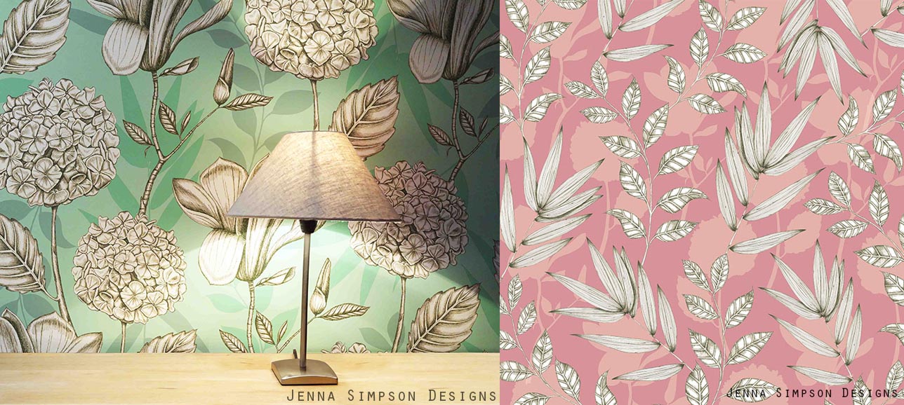
I think the green background of the design above will fit into the rest of the collection well, but I am concerned that the style might not suit. I could therefore create other design that is similar to this to bring the rest of the collection together if this is the case.
I also tried to create a watercolour effect in the background of the design below. However I don't think the design is successful as part of the rest of my collection, as the style looks completely different.

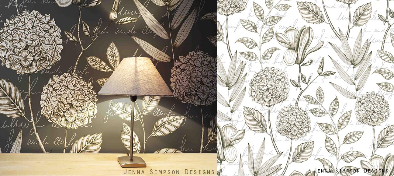
I preferred the designs (below) which involved all four different plants that I drew as there is more to look at within the design. I also felt that adding text in the background helped my designs to link more to the rest of my collection. However, I felt that the white design would probably fit into the rest of my collection the most. This is due to the text in the background, but also because the images look less graphic as the background colour is the same white as the imagery.
My context for this collection is similar to that of companies such as Osborne and Little, Harlequin and in particular Marimekko. I feel that Marimekko's prints have an impact due to their size, and they also digitally print their wallpaper onto varying widths of paper, which is exactly what I intend to do with my designs. As well as selling through their own site they also stock companies like John Lewis. This production method and scale mean that their wallpapers are specialist, designer products, and this is why I think my work would fit into the same market.
 |
| Marimekko |
I am really pleased with the developments over the past few weeks. Although it has taken a long time to do the drawings, I feel that it has made my designs a very high standard. The only problem I will have is that I can only use an element in one design. It will therefore be hard to chose which design or designs to take forward for my final collection. As I am finding this decision hard, I might look back at it in a few weeks time, and might have to redraw some elements if I want to include the design in my final collection.


