Wednesday 31 October 2012

First day in the print room is underway!

Today was the first day that I ventured into the print room. I was very nevous but excited at the same time to see what I could produce and no doubt see the mistakes I knew I'd make. I kept telling myself that it was a learning experience and I would eventually get better to keep me going through the day; although that was hard to believe.

The first thing on the agenda was to mix some dyes that matched my colour scheme. I decided to stick with pigment dyes to start with because they seemed easier to make, however I struggled to make colours accurately. I ended up making 6 colours but I found the browns the hardest to mix.


After preparing my workspace I decided to start printing on the range of fabric samples that I had recently bought. I found it hard to mask off my screen correcrly at the start, but after a few mistakes were made I really grasped it and by the end of the session I'd produced my first two prints!!


Saturday 27 October 2012

My first exposed screen!

Yesterday I decided on the motifs that would be going onto my screen. I arranged these so that the space could be used effectively whilst having a selection of motifs to work with. I also kept some motifs together so they could be used together when printing, for example the two birds and the line of leaves.


 We were asked to print these out onto A3 acetate so that they could be exposed onto a screen. 


This is what the screen looks like now that it has been exposed and I'll be using it in the print room next week to create my first fabric samples.


Thursday 25 October 2012

Colour Scheme!

For this project I wanted to achieve a sophisticated autumnal look. I had to chose a picture and represent the colours proportionally on a colour strip to create my colour palette. This would then create my colour scheme and to my surprise, no pictures of autumnal scenes or leaves had the right colour balance, they were all too bright, orange, green or dull. The picture I chose in the end was from a cookery book, and here are the results.


Above is a moodboard which I made to help me with my autumn theme.

Tuesday 23 October 2012

My first motifs on Illustrator

This week I have been working out the basics of Illustrator. I used my hand drawn motifs as inspiration to create my computed ones. To start with I designed some basic bird and leaf shapes.


I then tried to replicate the hand drawn qualities of my mark making motifs on the computer which involved experimenting with the different textured brushes and line tools.

The next idea that I tried was combining my solid black motifs such as birds and leaves with the mark making motifs to create patterns inside the motifs.


I loved this idea as it joined all of the elements together, however I decided that for my final screen i'd separate the elements so that I could layer them using different colours, or use the elements separately, therefore not restricting the possibilities in the print room.

After learning the basics, I tried to create a composition with the motifs I designed using colour to get an idea of how they would develop in the print room. This should hopefully lead me to making decisions about which motifs to put onto screen next week.

Wednesday 17 October 2012

Mark Making!

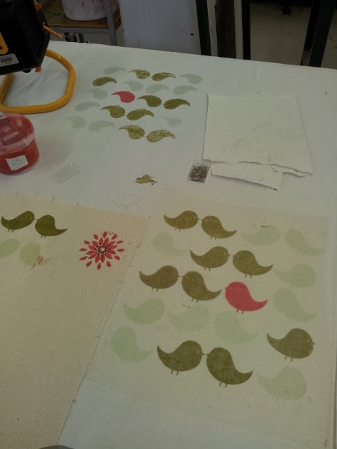
This week I have been very busy creative motifs ready for screen printing. As part of this I have tried to explore relevant forms of mark making. I have used objects that are relevant to the theme of my journey to do this with, including litter and leaves.


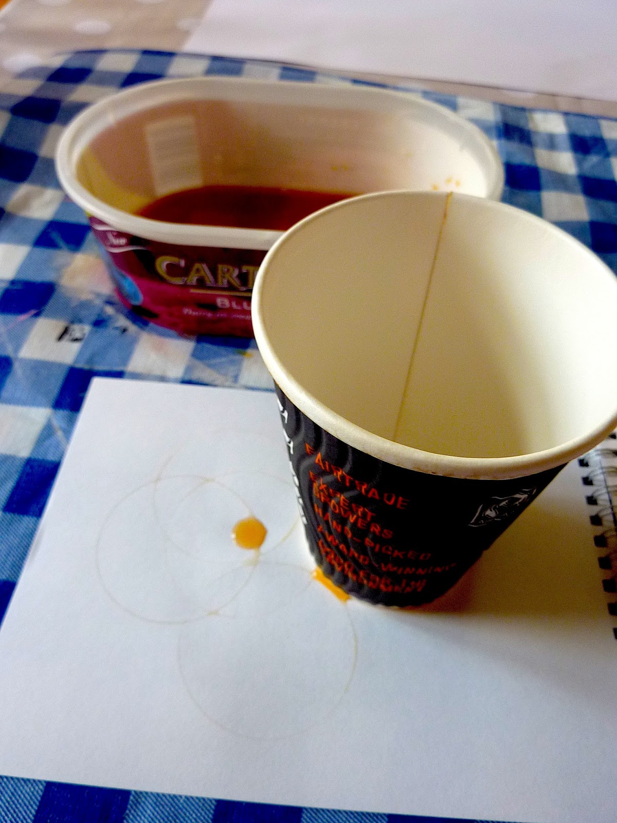
The motifs in the picture above were created in a variety of ways. For example, the circles in the bottom right of the picture were inspired by coffee cup stains. 

As I have been concentrating on litter in my journey so far, I wanted to experiment with incorporating it in a slightly less obvious way. I used a left over coffee cup from a morning in the studio dipped in ink to create some different shapes. I quite liked the unevenly distributed splodges of ink aswell which added some character.

The sheet in the bottom left of the picture was created by using leaves in a variety of different ways. Some marks were created from prints of leaves with ink on to highlight the venation. I quite liked the effect of this as it looked like a realistic leaf, however some worked better than others. I liked the simple leaf shapes' effect best as it was easy to see its shape.


Others were drawn with the stalk from a big oak leaf. It acted like a dipping pen and was quite successful, but it worked so well that it just looked like any ink drawing, and the implement didn't add any extra character. I will try a more flimsy stalk in the same way and see if this does create a different look.


Some others were drawn with the leaf itself which with the waxier leaves worked quite nicely, sometimes creating a double line which was a nice effect. However, flimsier leaves didn't create enough of a line, so weren't as effective.

Marks like the ones shown in the sketchbook page below were inspired by some toadstools that I found one day when walking past a nursing home to university. The scale of them really surprised me and I loved the colour and pattern on them. 


The circles on top of the toadstool are represented here, as well as the texture that the tearing of the mushroom created. The other two patterns were from other toadstools which had a less circular pattern on top.


Some of the other patterns that I have created were developments from the studies I did consisting of lines made whilst on the bus and walking. The circles are developments of the coffee stain idea, because I felt like they were too regular, where as these ones have a more hand drawn quality.


The remaining square based patterns are inspired by the fabrics on the bus that I travel on to university every day. One print is made up of brush strokes and the other is composed of prints from corrugated cardboard.

I think some of these motifs will compliment my other drawn motifs really well and the next stage will be to select my favourite ones ready to be developed onto screens.


Thursday 11 October 2012

Motif Madness!

This week I have been concentrating on making motifs so that I can transfer my favourite ones onto screens for printing. I have found this challenging for many reasons, one of which is working in black and white. I love colour so having to do them in black to be put on a screen before colour is added is a challenge in itself. I am also struggling to draw out good images from my visual research so far: my usual style is fine lines and shading and these images have to be the opposite. They have to have defined black edges so that they're crisp when being printed, and I can tell that it is going to take a while to get used to!


This is the work that I have done so far, and before going any further I want to reflect on what I have done to see where development is needed.

The piece in the top left of the picture consists of a black cut-out of some motorways around manchester, including the M60 orbital. These roads are part of my journey frequently so I tried to incorporate them into a motif. After doing this I was doubting what it looked like so I scanned it into the computer and quickly tried to rearrange the image to create a pattern, shown below, to show how I might use it in the print room.


The motifs in the middle of the top row consist of my physical mapped journey on the bus every day into university (the line in the middle includes the walking too). The line on the left is the route shown by the bus map (which wasn't proportional), the line in the middle is the exact mapped journey, and the line on the right was my interpretation of my journey whilst having my eyes closed. 

The third set of motifs shown below were inspired by my sketchbook pages, also shown below. I did these by sitting on the bus and putting my pen to paper loosely and letting the buses movements do the drawing. I also used the same technique whilst walking home to get some harsher lines. I then transferred this to motifs using ink and twigs that I found on my journey home to get different thicknesses of lines. If I had a set of a few of these lines on a screen, they might provide a nice background for other motifs once repeated, or even a pattern in themselves.


Leaves are only something I've recently started looking at. I seemed to some how ignore them whilst travelling to and from uni, looking around for anything to draw, missing the colourful autumn leaves that were under my nose. The motifs were drawn out from ideas in my sketchbook.


So far this idea has given me the most inspiration. I could fill the leaves with map patterns of my journey and print them that way. Or I could simply print the solid motifs in different colours and print a few leaf skeletons on top in gold or dark brown.


My final set of motifs for now are the pigeons and birds inspired by my first trip to Liverpool. They are based on Patrick Murphies 'Pigeon Street' so I tried doing some simple line drawings as well as other solid black birds and Pigeons.


Some more Motif ideas to develop...

  • Investigate and develop litter motifs continuing from my sketchbook, inspired by Zakee Sharif's piece below.
  • Draw and create motifs based on the mushrooms that I found outside a nursing home on my way home, possibly inspired by the pattern below by Marilyn Patrizio.


    Monday 8 October 2012

    Manchester!

    Today I travelled into the centre of Manchester to look for print inspiration. I started off looking in high street shops such as New Look, H&M, Debenhams, Republic and Urban Outfitters. I found lots of prints that I loved so I took lots of pictures. After this I visited some more upmarket stores including Harvey Nicols, Selfridges and Ted Baker. Unfortunately some of my favourite garments I couldn't take pictures of, but here are some of my favourites.

    The first picture here intrigued me because of how simple but effective the pattern was. It reminded me of one of the squares we did for the first drawing task, 'broken lines on a smooth surface', shown on the right.


    I also found that animal prints are very popular at the moment, the most prominent being snake skin and leopard print. In the example on the left I particularly like the blurring impression used to enhance the print. The print on the right caught my eye because of the lovely colour palette as well as the smooth texture of the fabric.


    This example caught my eye because of the kaleidoscopic imagery used. I found this mirroring quite popular throughout the day.


    These next two prints use florals and branches in a very modern way. The colours in both excite me and maybe the reason that I like them is because they don't immediately shout out floral, they're intriguing to the eye. Throughout the day I spotted that the traditional floral imagery is being used a lot, however this is the kind of floral pattern that interests me. 


    As well as visiting clothes stores, I also went to Paperchase which never fails to inspire me. I found tonnes of inspiration here but this notebook particularly stood out to me, with the pale greys and whites providing a perfect background for the colourful birds.


     Next, I visited Abakhan Fabrics, and I loved being able to feel so many different fabrics and investigate their texture and patterns. This one was one of my favourites because of the use of colour and pattern.


    Friday 5 October 2012

    Fun times on the bus!

    Today felt a bit strange, I tried to do some drawings in my sketchbook on the bus to reflect my journey home. It turned out how I wanted it to (kind of) but I'm pretty sure everyone thought I was a nutter. 

    Soon after getting on the bus I got out my sketchbook to draw, and I quickly realised that what interested me most was inside the bus, such as patterns and litter, rather than the buildings and roads outside. I took an interest in the litter on the floor and what people were wearing; it was very hard to draw people's belongings without them getting suspicious. At one point the school boys shoes in front of me caught my attention. The leather was frayed and they looked quite battered which only intrigued me more. I started to think about the shoes journey and what they must have been through to look like they did.


    I also found that the annoyance of a shaky bus could play to my advantage whilst sketching. Although at times it looked clumsy, it added a free feel to my work. I also played around with keeping my pen on the page and pulling my sketchbook past the pen to make a line that became jagged with the movements of the bus. The last line I drew used the same concept except it was when I was walking off the bus.

    As development of this, I'd like to try doing more of the movement lines because they reflect the rhythm of my journey. I'd also like to draw more of the rubbish on the buses and possibly think about collecting bits to play about with in my sketchbook.

    Thursday 4 October 2012

    Colour Colour Colour!!

     This week I have been concentrating on colour! At the start of the week we used Gouache to create a colour wheel and colour strips. It really helped me to develop my colour mixing skills as we had to change from one colour to another using 20 different stages.


    As part of this task we were asked to try and create the colours of certain words such as mushy peas, elastoplast pink and bluebell. It was great fun and really interesting to see how and why some people mixed their colours so differently.


    Today I experimented with Gouache and colour even more! I created 3 stripes and had to pick out the colours from some drawings that I had done and represent them in proportional stripes. For example the far left stripe represents the colours in the top drawing, and the middle stripe represents the whole space of the top drawing and the lines of the birds themselves. I loved the pattern that I ended up with, and to me, they represent the colours of my journey to Liverpool very well.