Friday, 28 December 2012

Sharon Johnstone

 After doing some basic oil and water experiments, I wanted to look for some inspiration as to how I could develop my ideas. 

I tried using food colouring to colour the water, but the food colouring didn't add to the effect as the oil also changed to that colour.
I tried swirling the oil to separate the oil into different bubbles, but I found they all joined into one bubble.

I found an artist called Sharon Johnstone,
 a fine artist who enjoys macrophotography in which she also explores the relationship between oil and water. Her website gave me some tips as to how she creates her work, for example, putting a picture under the glass rather than food colouring, to add some texture to the end photo, and also using washing up liquid to help the oil bubbles stay separate.


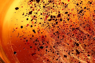
www.sjfinearts.com/galleries/oil-water-abstracts

I also found another very interesting blog which inspired some ideas, http://omnivorenz.wordpress.com/tag/oil-and-water/


Some more experiments with oil and water, this time with acrylic paint rather than food colouring.


Saturday, 22 December 2012

Oil and Water!

After enjoying the effects of oil resists on my chromatography experiments, I wondered how else I could use oil, water, ink and paper to create some nice results. A case sprung to mind from my contextualising practice research in which I studied the Schmoller Collection of Decorated Papers which included marbled papers. I loved the effect and wanted to try and achieve the same look with oil paints and water. 


I added turpentine to oil paints to make it very liquify, and dropped it into water (as shown above). In some cases I disturbed the oil paints to create different patterns. 

I also explored the idea of having oil on water to see what effects I could achieve. I loved the effect of the bubbles as the water and oil were mixed.


Ontop of one of my marbled papers I drew the patterns of these bubbles with biro.


Wednesday, 19 December 2012

Ink and Water

As I have found myself, Ink, water and paper can create lovely patterns and colour, but what would happen if I removed the paper? I'd like to explore how ink and water mix, such as in this lovely photo by Lin Van der Heiden.


It would also be great to see how this changed when oil and other resists were added. Marbling is one technique which I could use, putting oil paints on water and placing paper on top so that the floating paint comes off on the paper.

Sunday, 16 December 2012

Chromatography resist experiments.

This week I have been experimenting with how I can make my chromatography more interesting. Normal chromatography forms a line of colour at a certain point on the paper, but I want to create  pieces with more colour in the white space. I decided to try out different resists and liquids that I found around the house to see what affect they would have on my experiments. All of these were done with one line of black marker at the bottom, and the results are very different! Here are a few of my favourites.


They all seemed to pull the colour along the page much more, and they created lots of interesting patterns and effects.


Friday, 14 December 2012

Drawing from my Chromatography

After doing so many experiments with chromatography, I wanted to start drawing from them and developing my ideas further. 

This page in my sketchbook consists of two of my chromatography experiments (small) and a bigger representation of the separated colours using gouache.
I then decided to see if I could abstract my work even further by taking some of the line qualities and pattern from these sketchbook pages and translate it into a drawing which doesn't obviously show chromatography.


To expand on my ideas further, I went to the library to gather some books based on chromatography. Many of them contained pictures and graphs so I took them back to the studio to work with. I walked around the table I was working on and picked up all of the 'data' I could find (bits of unused paper that I could relate to what the people around me were doing) and used these as a background. Then I placed ink and water on the different pieces of paper to see how the colours separated. When this was dry I painted on images and text from the chromatography books in ink, to form a collage of different forms of data that I was exposed to.


Tuesday, 11 December 2012

Ink experiments!

After experimenting with chromatography, my data showed me that black ink contained the most colour, so was most interesting to experiment with. As a development from chromatography I decided to let the ink spread on flat paper with water (rather than suspending it in a bowl of water).


The results were incredible, people thought Id done it with watercolour, not black ink! I have been collecting data based upon the amount of water and ink applied. The example below had a consistent amount of water, but increasing drops of ink, from 1 to 12. I have done a similar example with a consistent amount of ink, and increasing drops of water.


I now need to consider how I can make this data into art work, as well as investigating how colours mix together in different conditions.

Saturday, 8 December 2012

Finding a direction for my data!

There is so much data around us, from obvious charts and graphs, to addresses in our address book and the finger prints on our fingers. I really wanted to chose a project theme that would push myself out of my comfort zone, and to give me and the people who view my work, some food for thought. I decided to look at the hidden data within colour, looking at how they mix together, and the colours that different colours are made up of.

I've started the project by looking at a well known method of separating the colours that make up different colours: chromatography. I have recorded the data from different brands of black marker pens and coloured felt tips. Below is a video which I created from taking pictures of my chromatography experiment involving the separation of 5 different coloured felt tips. I took a picture every ten seconds, for ten minutes, to see how the colours separated in various pens.


After doing a very simple experiment I tried to make my data look more interesting, and experiment with mixing colours, and patterns to see what the results were. Here are some of my most interesting results, created using different techniques.


I found it interesting to watch how my patterns and pictures distorted when in water, and I have learnt a lot about chromatography. For example, the more ink you have, the slower the water travels, but when there is no colour in the way, water travels quicker. This is what created the bumps and lumps on the line where the water stopped.


Tuesday, 4 December 2012

Drawing day 1:

Today we got our brief for the sampling project: Data! So in today's drawing session we concentrated on drawing the natural data found in a tree cross section, as each of the rings show information about each year's growth. 

For the first two exercises we were given strict instructions: we had 30 minutes to complete it in, each band had to be no more than 3mm apart, we had to work on A1 paper and we had to draw concentric rings. I worked on the floor for both of these as well. An additional rule for the first task was that we had to use our left hand and draw it in pencil, without sharpening it as we went. This created data in its self, how HB pencils wear down over time. This was the result, and I really liked the quirky, shaky lines it produced, as I couldn't have produced them with my right hand. It represented a trees cross section well too, and if I had done it with my right hand, it might have been too perfect.


The additional rules for the next drawing were that we could use our correct hands to draw in any soft media, which had to be extended on a garden cane/dowel. Mine was very long which made it hard, but towards the outer layers it was easier because the curves were less harsh. I liked the rippling effect it created, but there were a few slips of the charcoal where I lost control at the top/bottom of the curve. This does add character but it can look messy. When all of these drawings were put together, it was great to see the variation of tone when people used oil bar or graphite.


The only instruction for the last task was to draw directions out of a maze. I decided to use some of the techniques I had learnt by working on the wall, and using my left hand. I used graphite sticks to draw this maze inspired by the drawings we had just done on the tree trunks. I worked from the centre (with a sharp point) to the outside with the graphite getting blunter and showing more of the pitted texture of the wall.