Showing posts with label Artists references. Show all posts

Tuesday, 18 November 2014

Review Week

This week was review week, and we had to present our work so far in powerpoint form to two tutors and a group of our peers. I used the opportunity to reflect on the work I have done so far and see what parts of my work need more research or more development.

A key part of the presentation was establishing our context. My work for this project is for a surface pattern context, and I am considering four main product areas; wallpaper, stationery, giftware, and soft furnishings. At the moment I can see these dividing into two collections, of a larger scale and smaller scale. The decision to do this has been inspired by my two placements at Tigerprint and Digetex, as well as some key contextual influences.

Rachael Taylor is a surface pattern designer who designs for a large range of products including lamp shades, duvets, throws, cushions and wallpaper. As well as being inspired by her work contextually, I also love her drawing style as it stays hand drawn and quirky.

(Images from Rachael Taylor Designs)

As well as being inspired by designer makers, larger companies like Paperchase also inspire my practice as they have ranges of patterns that are produced across a variety of products such as gift wrap and stationery.

(Images from Paperchase.com)

Compared to Rachael Taylor, they have much lower prices as they are a high street brand. At the moment I am not sure whether my work will be aimed at high end or high street products

As well as examining my context, I also visited a Close up Exhibition at MOSI. It consisted of microscopic images of natural forms which I thought would give a good twist on the work I am doing at the moment.

Image from Come Closer Exhibiton

The geometric nature of these images lead me to think about butterfly wings, and other geometric shapes found within nature. I therefore gathered some first hand research at a zoo and completed some drawings of the patterns, with the intension to mix these patterns with some watercolour based paintings at a later date.


Tuesday, 7 October 2014

Botany and Data Collection

After my first tutorial on Tuesday with Alex, I have spent the last week looking into Botany as a way of representing nature scientifically.

Botanical Drawing of Oak branch - www.lizzieharper.co.uk
I looked at botany books from the library to study how botanists drew, including their use of composition, media, language and subject matter. I produced a few drawings in response, looking at plants that were beneficial to humans, such as he crocus which is thought to contain a cancer cure. I realised that most botanists drew tonal drawings in pencil and then painted over their drawing, and left some areas in black and white to emphasise the area in colour which I felt worked well. I felt that the Cone flower drawing below was the most successful, as loved experimenting with watercolour on top of pencil, and I also thought that leaving some areas without paint worked well. I used the paint to emphasise the bits of the flower that I thought were most important

Cone Flower drawing inspired by Botany illustrations

This drawing also lead me to think about the anatomy of flowers, due to the cross section at the bottom right. I have found an amazing book in the library called The anatomy of Flowers which has massively inspired me. I am looking forward to getting the chance to explore this next week.

Anna Gillespie Sculpture made of Acorns

This week I was also inspired by Anna Gilespie after seeing one of her sculptures at Artzu. She uses materials that nature discards which seem meaningless. I decided to draw some of her subject matter, as well as taking this as an opportunity to collect my own ' scientific data' on my walk into University. I passed 3 beech trees and collected seeds from each, drawing their different colours and mapping them as I went. Although this seemed like a small task at the time I think the idea of representing data naturally has a lot of potential and I intend to develop this further as a result.

Sketchbook page about collecting Beech Seeds.

As well as drawing beech seeds, I decided to collect other materials discarded by nature and draw them in a botanical way, linking both elements to my work this week. I used different media and paper to experiment, and I thought that the different sycamore seeds on the black (below) worked particularly well, as it's striking and the colours stand out. The drawings below also represent how nature changes over time, as the Hosta leaf has started to decompose and the top sycamore was dried out, linking to the idea of representing data mentioned in my learning agreement.

Sketchbook page: Decomposing Hosta leaf (left) and Sycamore seed collection drawing

This idea of using time as a way of collecting data could be developed next week, along with looking further into the anatomy of flowers.

Saturday, 6 September 2014

Visiting the 2014 MMU Degree Show: Pip Pittman

Pip Pitmans work immediately caught my eye when I walked into the degree show. The large floor cushions shown below were on display and their intricacy and colour immediately fascinated me. I also love the fact that she has made such professional end products as part of her show; I could easily see them in a shop.

Pip Pittman's floor cushions - http://www.pippittmandesign.com

After reading more about her work, it is clear that she thoroughly researches her subject matter using a variety of media including photography, drawings and printing, to get to grips with her subject. She has recently been inspired by 'natures gift' and is passionate about surfaces that surround us every day. This idea of 'natures gift' is very similar to the kind of concept I want to investigate next year. I am inspired by nature but don't necessarily just want to draw flowers, I want to delve beneath the surface.

Pip Pittman's Tote Bag - http://www.pippittmandesign.com

 Something else that inspired me was the wide variety of products that she applied her designs to, including wallpaper, bags, diaries and ceramics as shown in the pictures above and below. It shows that she can use colour and scale really well and work for a variety of audiences. This is another aim that I wish to achieve this year; I want to create designs for a wide range of products.

Pip Pittman's Diary - http://www.pippittmandesign.com

 Pip's love for texture also comes across in her work, especially in this ceramic piece below. I love the line quality in all of her work, and these two elements are something that I want to achieve in my work next year as well.

Pip Pittman's Ceramics - http://www.pippittmandesign.com

Over all visiting the degree show was an fantastic opportunity and I gained inspiration from every single student, including those who weren't from Textiles.

Friday, 5 September 2014

Visiting the 2014 MMU degree show: Lindsay Swan

Lindsay Swans work was also very inspiring. Whilst walking through the degree show her work caught my eye because of the fantastic patterns as well as the 3D products on her display.

Photo taken from MMU Degree show - Lindsay Swan

What I love about her prints is the intricate use of colour and also the scale, composition and contrast within the collection. There is so much texture in her work, and it appears hand drawn yet digital at the same time. Her colour palette is beautiful and I hope that the colour in my collection next year is that good.

Photo taken from MMU Degree show - Lindsay Swan

After reading more about her work, I found that she was inspired by a month of traveling in Thailand, and the patterns and architecture that she came across. She also mentioned that she was inspired by an artist called Barbara Hulanicki who I hadn't heard of before, and looking into her work was also very inspiring for me.

Photo taken from MMU Degree show - Lindsay Swan

The context for her designs is gift wrap which is something else that I am very interested in. I have always loved patterns for gift wrap and this is one option that I am considering as a final outcome next year. Unfortunately after searching for Lindsay online I can't find any more of her work, from a website, blog, twitter or Linkedin. I would have loved to see more of her collection so I have emailed her to see if I can learn more about her wonderful work.

Thursday, 4 September 2014

Visiting the 2014 MMU Degree show: Jessica Brown Creations.

When this years degree show was on I took the opportunity to visit it twice, looking around the Textiles in Practice work, as well as various other programmes in depth. There was so much inspiring work but I have chosen to write about my 3 favourite designers as their work has inspired me and I wish to create similar work next year.

Some of Jessica Browns Stationery Collection - http://jessicafloralscent.tumblr.com

Jessica Brown Wallpaper Design - http://jessicafloralscent.tumblr.com

My favourite student was Jessica Brown. Her work stood out immediately with the way she displayed her work and prints. I was inspired by her work because it is exactly the kind of collection that I want to be producing by the end of next year. Her wallpaper and stationery collection proved that I she can work across a range of products with a variety of scales, which is something that I want to show in my portfolio as well. I also liked the way she displayed her work in the vintage crates (as shown below), as it stood out because it was different to everyone else's and looked professional, which is something I will take into consideration for my show.


After reading through her blog, it is clear that she is inspired by organic and natural forms, and uses her strong drawing skills to enhance her collections. This is exactly how I work and I want to make sure that I keep a hand drawn, but digitally enhanced, element to my work.

I also loved her choice of colour palette and colour is something that I intend to work on this year too. It is also clear that she had done a lot of market research about stationery and different designers and ways of designing, as well as concentrating on her brand.

Jessica Brown's Colour Palette Board - http://jessicafloralscent.tumblr.com
Jessica Brown's Market Research Board - http://jessicafloralscent.tumblr.com
Jessica Brown's Business card design, and logo design - http://jessicafloralscent.tumblr.com

I hope to achieve this in my projects next year and being inspired by Jessica's work has shown me that brand and great product knowledge is just as important as designing.


Wednesday, 30 April 2014

Colour, Inspiration and Internship!

My Colour Palette: 

After creating a few designs, I have decided on a final colour palette for my designs. The inspiration for my choice of colour came from one of the colour palettes that Debbie gave us initially which included bright pinks, pale blues, yellows, greens and greys! I loved the idea of challenging myself by using bright colours, as I usually work with subtle, cool colours. When I started designing with the scheme I found that the palette naturally started to develop, and below is the final colour palette that I chose, along with some colour source images found online. 

Image A: My colour palette

Clarissa Hulse:

I have spent some time during this project looking at designers other than Digetex that provide me with ideas and inspiration in relation to the brief. Clarissa Hulse is one designer that is particularly relevant, as she designs cushions for the home, with bright bold colours. The way she uses her colour palette is very clever, and her combinations of colours work really well together, and this is something I want to take into my own practice and develop in my designs.

Image B: Bright cushions by Clarissa Hulse. http://clarissahulse.com
Image C: Bed sheet set by Clarissa Hulse. http://clarissahulse.com

I like the fact that she uses her prints along side solid bold colour, such as on the duvet (Image C) and on the back of her cushions (Image B). Her designs also consist of only two or three colours, and I feel that I could have some designs like this in my collection that are simpler, in contrast to some complex watercolour based designs. I also feel like in my collection I could suggest a complimentary colour for the back of each cushion to enhance my designs.

Image D: Triangle collage of Designs inspired by Clarissa Hulse

Image E: Stripe collage of Designs inspired by Clarissa Hulse

Above are some examples of how I have embraced the way she works. I have taken the idea of introducing block colour between designs on board and I think it adds a really interesting quality to the designs which could be part of my final collection.

Internship with Digetex:

After meeting with Debbie twice, she emailed me and asked me to go down to Digetex in Trafford Park for an Interview. I was so excited to be offered this opportunity as is means that she is really impressed by the way I have been responding to the brief she has set, and proves that I have embraced new challenges, understood her professional brief, and met her requirements. I was lucky enough to be offered an Internship with them, and I am so excited! I will be starting throughout this project, doing a day a week working in their studio. From then on I will be working 4 days a week over the whole of summer! It will be a fantastic opportunity and I can't wait to see what I learn! 

I also feel that this will enhance my work for Unit X, working even further in collaboration with the designers in the studio, and having first hand access to the way Digetex work and working in a professional context.

Saturday, 1 February 2014

Khristian Howell

One of my inspirations for this project has been Khristian Howell. I love her use of colour and hand drawn elements combined with digital elements.


She also designs for a similar range of products to those that I want to design for in this project, including phone cases, stationary, note books and cushions.


I also like the way that she uses motifs. A lot of the elements are hand drawn and scanned in, and some are purely digital. She then plays with opacity, transparency and lines to create a design with different qualities and depths.


Monday, 16 December 2013

First Inspirations.

Starting a new brief is always daunting but I have found that the first thing I always do is create a brainstorm. It helps me to sieve through my brain and fish out ideas that I didnt have at first and so far I have a few different areas that I am interested in.

Based on the theme of Order and Chaos, I have thought of some more thinking points:
  • Ordering chaos
  • Creating chaos
  • Order within chaos
  • Making order chaotic
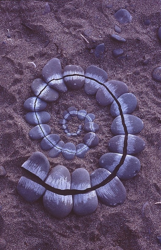
Based on the idea of ordering chaos I immediately thought of the artist Andy Goldsworthy, who takes random natural objects and orders them into a sculpture. The chaos and mess that is around him is suddenly aesthetically pleasing, and becomes a piece of art. I am also inspired by the fact that he doesn't edit his materials, but works with nature as a whole no matter what it looks like.


I would like to take inspiration from the way he works and bring it into my own practice. For example, one way that I could do this by creating a chaotic piece of work and cutting it up to order it.

This week I also looked into what objects in nature inspire me, and I started looking at the Pinecone, because I have had one sat on my desk for months. I found it on Formby beach and I knew that I loved it but didnt know what to do with it, and now it seems to fit in perfectly. When I started to draw and observe the object, I began to understand even more how beautiful and symmetrical it was!


I therefore did some research into this and found out about Fibonacci's Sequence, which are numbers that occur in nature. They often appear as a swirl and can be seen everywhere; in leaf arrangements, scales of a pineapple and the brackets of a pinecone.


I am really interested by the mathematical side of nature, and the symmetry involved in it. I think I will also experiment with media during the christmas break, to investigate order and chaos more thoroughly. I aim to have research and drawings from this, as well as the nature part of the brief, and I intend to then try to mix the two together using various methods when I have a body of visual research to work with.

Monday, 11 November 2013

Incorporating Light back into my designs.

When placing my designs onto lamp shades, I love the glowing quality that is put back into my designs,  just like when I took the original photos. I want to try and create this effect on the wallpapers too so have done a bit of research into how I could go about doing this.

Jonas Samson

Jonas Samson creates light emitting wallpapers with built in LED lights that can be turned on and off, which could be one direction I could consider going in; adding hints of light where relevant.


Meystyle LED Wallpaper

Meystyle also use LED lighting for their wallpapers but in a  slightly different way. They use highlights of lighting rather than lighting up the whole design.


When relating this to my designs, I could light up the whole design to give it a glowing effect, or just add lights to highlights that look glowing, to emphasise this quality.

Thursday, 7 November 2013

Investigating my market.

This week I am focusing my attention on where I want my final digital designs to fit into the current market. I decided in the tutorial that I wanted to make prints for interiors, so I have considered designing for large wall murals or panels,  as well as objects like cushions and lampshades. Below are some examples and artists that have given me some ideas and inspiration.

Maxalot

Maxalot are a wallpaper company that create large scale artworks for interiors. I love their use of scale and colour, and their work has really inspired me to think about designing for wall art of some form.


This dark design based on galaxies reminded me of the designs I am doing at the moment because they're dark and have brown/orange tones.


Digitex Wallpapers

Like Maxalot, Digitex Wallpapers create large scale images for wallpapers that aren't in repeat but are a  design in themselves. This is the kind of idea that I want to reflect in my work too.


Wall Panels

I also feel that wall panels might be a good option for my designs. I have thought about splitting my design into 2 onto 2 canvases, to bring in the element of 2 parts that is in Piano Phase (created by the 2 pianos).


Lamp Shades

Another interior item that I have considered designing for is lamp shades. When I have been taking the photos that I am using for my prints, I have used the holes in the paper to let through light to make my photos more interesting. I therefore thought having these designs back onto a light source might put a glowing quality back into my designs. I have also thought about how I can embellish the print to allow holes to let though light from the shade, that would fit in with the design.


Soft Furnishings

I have also considered placing my designs onto softer furnishings like curtains and cushions. As an experiment I placed some of my designs onto an image I found on the web and I thought they were quite successful.


As a result of this research I am going to try and take some of my own photos this week, that I can use when placing my designs, such as blank walls, and plain lampshades and sofas.