Showing posts with label Unit X. Show all posts

Saturday, 9 May 2015

Unit Evaluation.

When I started Unit X, I set out clear aims:
  • Complete the Botany and Moments collections
  • Undertake a live brief
  • Enhance my online presence
  • Assemble a professional portfolio
  • Dedicate time to research printing/production methods for the degree show

I can confidently say that I have achieved everything I set out to complete, and I feel I have done this to a high standard whilst working to deadlines and managing my time well.

I knew from the start of the project that drawing elements for the Botany collection would take up a considerable number of weeks of the project, so by completing this first I allowed myself to plan the rest of the unit accordingly. This enabled me to undertake more research into 'moments of time' within nature, to draw upon within my Moments collection. I feel that both collections are completed to a high standard whilst showcasing the different styles I can achieve, along with good use of colour. Completing further market research has allowed me to refine my context, ensuring that my work is commercial, and suits the market that I intend for it to fit into. I believe that my work fits into each context because of the careful consideration of colour and scale: spending time creating high quality visualisations also allows other people to see how I envisage my work.

Creating a website and increasing my online presence has definitely been a strong aspect of this project for me. I have updated and created social media platforms such as Linkedin, Twitter and Instragram. I was also keen to create an online portfolio of some form and after researching into this I decided to create both a Behance account and a website, enabling members of the public, as well as companies and clients, access to my work.

Completing the live brief was another successful part of this project, as it allowed me to show how I can work slightly more abstractly. I also pushed myself in terms of colour and media, and drawing upon some of the research I completed in the previous unit was very beneficial. 

Putting together my portfolio has taken a lot of time but I feel that I now have a strong portfolio that I am proud to show and take to interviews. The way I have conducted my practice this year and last year has meant that I have a breadth of different styles to show, as well as the fact that I can work towards many different contexts including wallpaper, soft furnishings and stationery/giftwrap. Researching into how to present a textiles portfolio has been valuable to ensure that I presented work for different disciplines in the correct way.

I have also been actively job searching using my updated CV and new online portfolios. So far I have had a great response, including attending two interviews for textile designer positions; I am looking forward to seeing where my work will take me.

Monday, 4 May 2015

Preparing my portfolio

This week I have started to focus on getting my portfolio together. When assembling the whole portfolio, I have researched into the presentation of furnishing and surface pattern portfolios to make sure I adhere to industry standards. This includes factors such as including reference numbers on the back of designs, along with visualisations. However, furnishings differs from surface pattern in presentation, which is important for to me embrace as I have such a varied portfolio.

I have narrowed down the designs for the Moments collection, to create the final collection (shown below). I made the selection based on how the colour palette worked as a whole, whilst ensuring that each design represented a different moment, and no design used the same element as another so that they can be bought by clients.


I also felt that it was important to complete a gift wrap photoshoot to provide visualisations to include along side each design in my portfolio. After trying to complete this on photoshop using a blank present, I felt that the curves, angles and folds weren't realistic enough, so I styled a shoot with printed papers to achieve perfect results. 


I am happy with the final outcomes, as they look good in my portfolio next to my prints. They also compliment my website, as I took photos that can be used on the homepage (shown below). I ensured that the various wrapping accessories that I used (twine, rafia, natural objects) adhered with my theme and complimented the design I was photographing, enhancing the feel of the images. Having a visualisation next to my design will further ensure that my portfolio is professional and appropriate for my audience.


Testing foiling methods has been on ongoing research process throughout the unit. After finding a successful way to complete the foiling, it didn't work on the laser printed images because the glue beaded on the paper. I intend to refine this technique before the end of the unit. Alternatively, I could show a small swatch of the foiled design from an inkjet printer next to the full design from a laser printer.

I have also decided on the final designs for my Botany collection, which was difficult as I had numerous different designs that worked well, containing the same elements. However I am confident that this collection represents my concept well, whilst maintaining a strong colour palette, and mixing traditional and modern techniques together.


When presenting this collection, in order to work professionally, I need to include visuals and colour ways to suit the market I am designing for. I have dedicated a lot of time to ensure that the visuals show off my work in the best possible way, and the colour ways have a sensitive and complimentary palette. Below is an example of the information I am including on the back of each design: a visualisation, colour way, 2x2 repeat square and a reference number. 


I have also considered other practical features for my portfolio, including mounting each collection on heavy card to ensure that they are sturdy and won't crease. Testing has been completed for all of my collections to ensure that the final portfolio versions are printed to the correct scale, and I am happy with the colour and printing quality. I also intend to include a folder with boards showing the concept, research and context for each collection. 

Thursday, 9 April 2015

Developing the Moments collection

After completing a large proportion of my Botanical collection, I have started working on my surface pattern collection.


As my surface pattern work is based on moments in time, I wanted to make a print based on the pond in my garden, as I have always been fascinated by the amount of plant and animal life that inhabit it.


Some of the nature that I drew from consisted of plants, frogspawn, duck weed, lily pads, frogs, dragonflies and iris petals. The designs above represent the pond in the way I envisaged, however the colour isn't perfect, and I feel that the designs below have more potential, due to the good use of colour and composition. The Iris design would add a variety to the collection so far, and the dragonfly design captures the pond perfectly, corresponding to my initial learning agreement.


After visiting the Lake district over the easter break I wanted to use this as inspiration for my Moments collection as well. Whilst I was there I took photos and sketched things that interested me.


After drawing motifs to design with, I started to assemble designs. I think that the design on the left is visually appealing, however the vertical stripe is too strong, and it's too simple. The design on the right also didn't fit the brief as it doesn't convey the Lake District, however I feel that this is because of the colour use.


 The design below was based on Grisedale forrest and I am happy with the result, as it portrays the layering of trees on the hills, with a good use of colour and line.


I also really like the design below based on a visit to Grassmere because of the composition and the fact that it represents my visit. It also suits the products I am designing for well.


The context for the Moments collection is the high end of the highstreet. I can see my products being sold in companies like Paperchase and Selfridges. More specifically, the context for my work is similar to that of Anna Emilia and Khristian Howell. They both create and design contemporary, quirky stationery that sells on their own sites and through companies on the High street, such as Waterstones and John Lewis. The price range for these products is therefore between £5-£20, and is of a very high standard and quality. I therefore feel that my work fits this market because of the style of design, colour use and quality of final product. Creating visuals and doing a photoshoot will allow me to portray this to others as well.

Anna Emilia . Khristian Howell

Thursday, 16 May 2013

Unit X Evaluation!

Unit X has really pushed me out of my comfort zone: from working with different people, working in different locations, and working away from textiles, I have embraced the challenges and pushed myself as far as I could.

Throughout this unit, I feel that I have engaged most with the collaboration aspect of the task. I have grasped the opportunity to work with other students (FMS & TIP) with both hands, and I have made the most of having other people to talk and bounce ideas off. I attended every session to make the most of this opportunity, and have made an effort to get to know my group outside of the set timetable. I feel as though I contributed a lot towards the group, stimulating ideas and giving a direction for our collaborative work.

I feel that the strongest aspect of the project has been the underlying theme of Alice in Wonderland, which is an idea I generated in the first few weeks of visual research based on the number 175, (see previous blog posts). Although we all had our separate projects, having this theme to constantly feed the group with ideas has helped us to collaborate, talk about our work and engage with our final exhibition ideas.

Our group always had the idea to create a linking final piece on top of our individual pieces to emphasise the Alice in Wonderland theme, and bring together all of our work. Unfortunately all of the plans that we had were reliant on having our own gallery space so we could create an interactive environment. As Kraak Gallery doesn't suit our ideas, with such late notice we decided our efforts would be better concentrated on our individual final pieces. However in the future, I'd push this idea further and adapt our ideas to whatever space we are given.

Overall, I am very proud of my efforts, and my final outcome, but next time I would probably make more of an effort to create a collaborative piece harnessing the different skills from other people within the group.

Seeing the Exhibition!

After putting up my piece yesterday, I went in today to find the finished exhibition and it looked fantastic with everyone else's work in it! I am really happy with how my final piece turned out. I had a good position in the room and my cubes spun naturally due to the breezes from peoples movement. Because my space was so bright it was hard to cast shadows, but I did provide a labeled torch alongside my piece so people can cast their own shadows if its dark enough.


As a group, our Exhibition came together really well, we had pieces on the walls and the floor, and we had photos and installations. 


I also really loved looking around the rest of the exhibition to see how other groups had undertaken the collaborative brief of 175. I think the group called Action, (in Play) did a really good job of collaborating. They created these perspex triangles which all had each members art work on. I love the way their individual work came together as a vibrant and 3D installation piece.


I also loved this groups work. They created 'bricks' using yarns and wire, and placed them in an environment that was deteriorating, where bricks were missing. It created an interactive environment and I love the colours and textures. I also liked the way they worked collaboratively, as a few girls from textiles worked on this together.


Tuesday, 14 May 2013

Preparation for setting up the Exhibition tomorrow.

Tomorrow is the day that I get to go in to set up my work. Today I have finished my final piece and I am starting to think about the smaller details of how my piece will work together.


Above is a rough plan of how my piece is going to work. I am planning to suspend the cutout boxes in front of the missing words with invisible thread.

To link in with my shadow/enlarging theme, I have bought a torch to place alongside my piece some how. I have considered hanging it along side the piece with a tag (replicating the drink me label) saying "Light up the shadows" to give people a clue to see the swirling shadows created by the maze of each box.

Overall I am happy with the amount of boxes I have managed to do, as I think the piece has enough to it, without being so busy that it becomes confusing. As I used the words that existed on the page, this determined the layout. Without these restrictions, I would have used my own judgement on placing the boxes, to possibly create a more aesthetic layout. However, this method has allowed my final piece to develop in a more organic way, as I removed my control, which I think adds more character.

Wednesday, 8 May 2013

Final Idea!

Today I collected my A0 print of page 175 of Alice in Wonderland and I am very happy with the result. I now need to start assembling my final piece, but since receiving the print I have altered my plans slightly.

On the practice examples that I have done, the words I have used have been a lot bigger than the words are now, so now they're far to small to make decent sized objects from. I have therefore decided to enlarge the words that I am cutting out by 175% of the size they are on the A0 sheet to make the objects bigger. This fits in with both my enlarging theme and the 175 brief.

I'm looking forward to getting started!

Tuesday, 7 May 2013

Rebus Books

The definition of a rebus book is...
A puzzle in which words are represented by combinations of pictures and individual letters.
I like the way these puzzles become a piece of artwork which you have to think about as well as read, and I would like this to come across in my work. This has inspired me to take my work in a slightly different direction. 

Rebus Puzzle/book

"A bee came and stung his foot"

The work that I am doing at the moment involves cutouts of patterns on different shapes. As the cutouts I have chosen reflect the themes and imagery in Alice in Wonderland,  I now feel like I needed a reason to be choosing the 3D shape as well.


Final Piece Idea.

I now have a final idea which involves an A0 sized scan of page 175 of Alice in Wonderland. I will then chose certain words from the page and cut them out (in a rectangular shape) and will make a 3D shape from whatever sized word I end up with. I will then cut into this with a pattern or image based on what that word says. This way I will be creating my own kind of Rebus puzzle.

So far I have experimented with a few different ways that I could do this. I have found that cubes are a good shape to create because of the shape of the cutout word. I have therefore tried having the text on the inside and the outside.


The word for this cutout was 'Petals" but having the word on the inside made it very hard to read.
This cutout was inspired by the word "Rose" and as you can see, having the word on the outside has meant that it is a lot easier to see.


I have also experimented by not making a shape at all, and just cutting into the word.

This cutout was inspired by the word "questions" and I also decided to hang the question marks which I cutout from the piece too.

After experimenting with these ideas, I think the cubes with the text on the outside work best but I might combine the idea of hanging the cutouts from the cube if it applies. I still need to decide whether to do one shape and keep it constant, or whether to do lots of different shapes and ideas (as I need to ensure that it isn't too confusing).

The idea is therefore that you read the page as a form of rebus puzzle: as you go along the text you will see boxes which represent the word thats missing. The pattern and the faint text should help reveal to the reader what that word is.

Friday, 3 May 2013

Kraak Gallery!

Yesterday we all found out that our work is being exhibited at the Kraak Gallery in the Northern Quarter along with all of the Record and Play group! I am very excited to work in such a large open space with such a lovely structure, but unfortunately it means that my plans for a final piece and our collaborative piece plans have to change due to the features of the space.


For example as there is so much light in the gallery, the shadows are going to be hard to create so I have considered making a film to go alongside the piece, which will be taken in darkness. Also, as our group doesn't have our own room/space, its going to be hard to create an interactive space for our work as it wont be clearly separated, as mentioned in a previous blog post, (http://jennasimpson94.blogspot.co.uk/2013/04/beak-book-workshop-tonnes-of-ideas.html).

Now that we know this, we have more time to consider how we can arrange our exhibition in this gorgeous gallery.

http://www.kraak.co/home/

Wednesday, 1 May 2013

Lumen Lamps.

Lumen lamps are designed by Adam Frank and are stainless steel oil lamps which, when lit, project a soft shadow on the wall. The further the Lumen is from the wall, the larger the shadow is cast. What I like about these lamps is that as the flame flickers, the shadow moves about organically. So I can consider what effect different light sources have on my shadows.


Development of cutout shapes!

This week I have been experimenting with shapes and patterns for some of my 3D paper shapes. I have experimented with themes, imagery and text from page 175 of Alice in Wonderland to give me some inspiration for my final exhibition. The shapes below represent the text '"I don't care about the colour" the Tiger-Lily remarked. "If only her petals curled up"', as well as trees and Tiger-Lily's.


I think the shape above is effective because its interesting and elegant, but the cube is also a simple and sophisticated shape which might compliment a complicated pattern better.


Friday, 26 April 2013

Beak Book Workshop = TONNES of ideas!

Today in a workshop we learnt how to make beak books. Although I had made them before and it was a simple technique, it stimulated lots of ideas within the group about how we could start putting our exhibition together.


On the left is the simple structure of the beak book, made out of an A4 sheet of paper, but as an exercise we tried to push the boundaries of what a book could be. So we opened up the inside of the book to create the structure below, joining 3 of our books together. The idea was that we had writing on the outside based on Alice in Wonderland, and an image of our work on the inside. 


I also played with the idea of a concertina book, taking the basic concept and joining lots of them together to create a trailing book shown below.


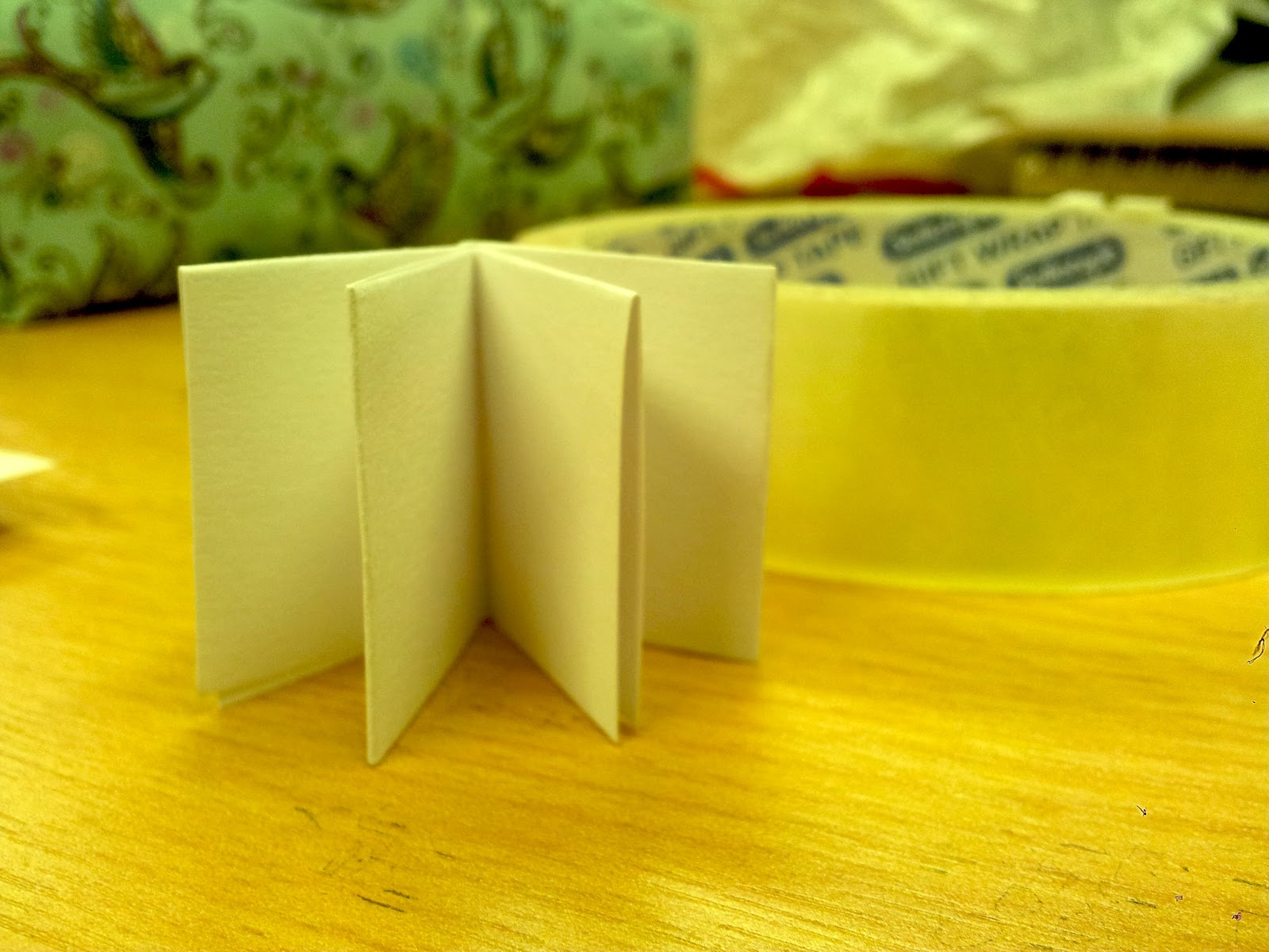
As a group, we then had the idea of creating tiny beak books, relating to the shrinking idea of alice in wonderland. The one below is no more than an inch high and we could incorporate these into our exhibition by creating a different design for each of the artists, and creating multiples of them for people to take away, to interact with the exhibition.


The idea is that at each persons work, there will be another persons small book, directing them to see their work. We hope to display these creatively within the space, and create an interactive wonderland (a rough example is shown below). 


We also thought of lots of other ideas for our exhibition to create our own wonderland, such as changing the dimensions of the door to make people crouch to get in, as though they were alice, and having art on different levels, such as mushrooms on the floor directing people. As soon as we know the dimensions of the space we get given, we can start thinking about these more.

Wednesday, 24 April 2013

A Maze of Patterns!

When I sat down to do work this week, I definitely found myself being stuck for inspiration. I find it hard to work when I feel like this, and I kept trying to do things which didn't work! After pondering over the idea of shadows and light, I eventually thought about the idea of a 3D cutout shape which, when light was projected on it, would look like an illusion, or maze of patterns (linking to the theme of illusion as mentioned in my previous post).


This was the result, and I am happy with the outcome. Although it was hard to make, I can see myself doing multiples of these for my final exhibition, hanging them from the ceiling and allowing them to spin naturally due to drafts, casting a lovely spinning shadow on the wall behind.


I could also create a video to go along side my pieces (a bit like the one above) to show them shrinking and enlarging as the object got closer to the light source When the shadow is spinning this definitely creates the appearance of an illusion too.

Monday, 22 April 2013

More cutout shadow experiments!

Since doing the shadow experiments in a cardboard tube, I really wanted to continue with the idea of projecting shadows. I therefore decided to try and relate the idea of cutouts back to Alice and Wonderland a bit more literally, to give me some inspiration for new ideas.

I photocopied page 175 of Alice in Wonderland and cut out every 1st, 7th and 5th letter (relating to the 175 brief). This was the result which I am very happy with. The image below is a projection of the paper onto a massive wall, and I love how the shadow of the page keeps its clarity.


I then went onto experimenting with bending and curving the page to see what result this had, and how it affected the projected shadows.


The shadows grew as they expanded across the wall which is perfect for my shrinking and enlarging theme.  I also think the idea of shadows links well with the theme of illusion and confusion which I think is also a prominent theme in Alice in Wonderland, so I might try to incorporate this into some of my next experiments.
Friday, 19 April 2013

Shadow Art!

After doing some work based on shadows at the start of this week,  (http://jennasimpson94.blogspot.co.uk/2013/04/inspired-by-anastassia-elias.html) and having a group tutorial, I have decided to look further into shadow art, as it interests me and I feel it would work well as an installation piece at the final exhibition.

I have found some artists which do very clever art with shadows, shown below. I like the idea of illusion because this is also a key theme in Alice in Wonderland. When first spotting some of the objects below, you may wonder what's so fantastic about them, until you see the shadow it casts and realise that its an amazing piece of art that captivates your imagination.
Fred Eerdekens
Fred Eerdekens
Kumi Yamashita
Tim Noble and Sue Webster
Kumi Yamashita
On a smaller scale, I found some other artists that use shadows in a simpler way which I think at times can be more effective. In terms of my work, I think repetition of shadows would suit my work well.

Christian Boltanski


http://www.subtours.com/cms/node/75
Cuentos Chinos (Chinese Stories) is an installation inspired by the traditional Chinese Shadow Theatre. In this installation the "actors" are cheap chinese products which were bought in the popular "all for one Euro" stores.
The products are conected with around 110 motors, solenoids, fans etc and distributed over 18 small theaters with 36x40 cm base. These sceneries are standing on top of Overhead projectors so that their moving shadows will be cast to the walls of the space. 

Kumi Yamashita
As development from this research, I will try experimenting with 3D sculptures that link to the work I have done so far, and see how they interact with shadows and light.