Showing posts with label Photoshop. Show all posts

Thursday, 9 April 2015

Developing the Moments collection

After completing a large proportion of my Botanical collection, I have started working on my surface pattern collection.


As my surface pattern work is based on moments in time, I wanted to make a print based on the pond in my garden, as I have always been fascinated by the amount of plant and animal life that inhabit it.


Some of the nature that I drew from consisted of plants, frogspawn, duck weed, lily pads, frogs, dragonflies and iris petals. The designs above represent the pond in the way I envisaged, however the colour isn't perfect, and I feel that the designs below have more potential, due to the good use of colour and composition. The Iris design would add a variety to the collection so far, and the dragonfly design captures the pond perfectly, corresponding to my initial learning agreement.


After visiting the Lake district over the easter break I wanted to use this as inspiration for my Moments collection as well. Whilst I was there I took photos and sketched things that interested me.


After drawing motifs to design with, I started to assemble designs. I think that the design on the left is visually appealing, however the vertical stripe is too strong, and it's too simple. The design on the right also didn't fit the brief as it doesn't convey the Lake District, however I feel that this is because of the colour use.


 The design below was based on Grisedale forrest and I am happy with the result, as it portrays the layering of trees on the hills, with a good use of colour and line.


I also really like the design below based on a visit to Grassmere because of the composition and the fact that it represents my visit. It also suits the products I am designing for well.


The context for the Moments collection is the high end of the highstreet. I can see my products being sold in companies like Paperchase and Selfridges. More specifically, the context for my work is similar to that of Anna Emilia and Khristian Howell. They both create and design contemporary, quirky stationery that sells on their own sites and through companies on the High street, such as Waterstones and John Lewis. The price range for these products is therefore between £5-£20, and is of a very high standard and quality. I therefore feel that my work fits this market because of the style of design, colour use and quality of final product. Creating visuals and doing a photoshoot will allow me to portray this to others as well.

Anna Emilia . Khristian Howell

Tuesday, 31 March 2015

Developing the Botanical collection

I have been continuing to draw and paint images for my wallpaper collection for a large proportion of this unit, in order to meet the requirements of my learning agreement. As they take a long period of time to draw, I scan them in at different stages so that I have a large quantity of imagery to work with. This is illustrated below.


Due to the amount of time that these illustrations take, I plan out drawings before hand to ensure that I will be able to use them in a design. As well as creating the design I planned originally, I also designed other potential wallpapers, some of which are shown below.


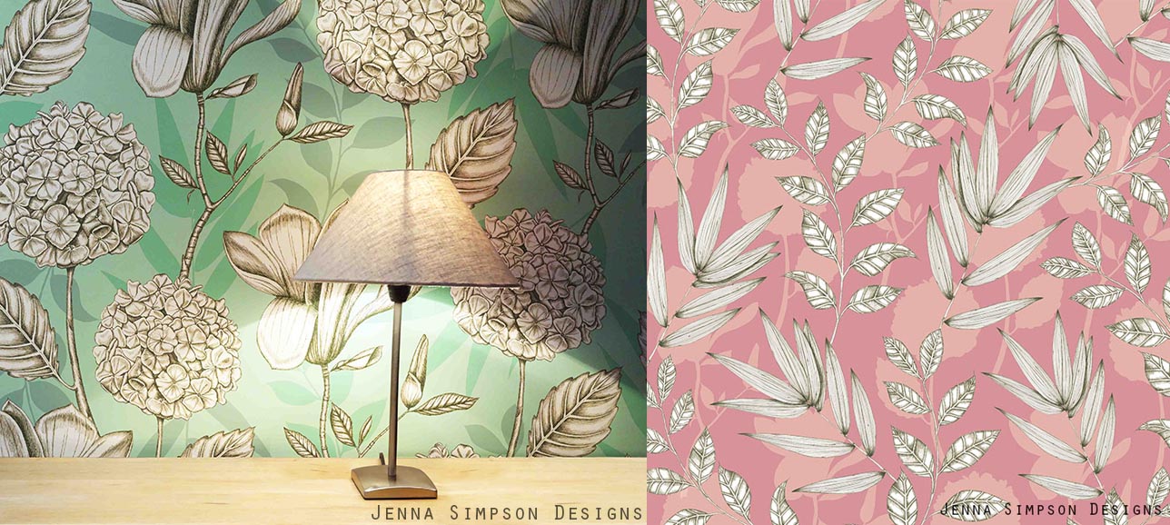
The elements that I have been drawing over the past few weeks have been meadow plants, so I was keen to get across that feeling of delicate, yet cluttered flowers. I feel that the prints shown get across this feeling whilst staying contemporary. I think they also work well because of the contemporary composition and colour.


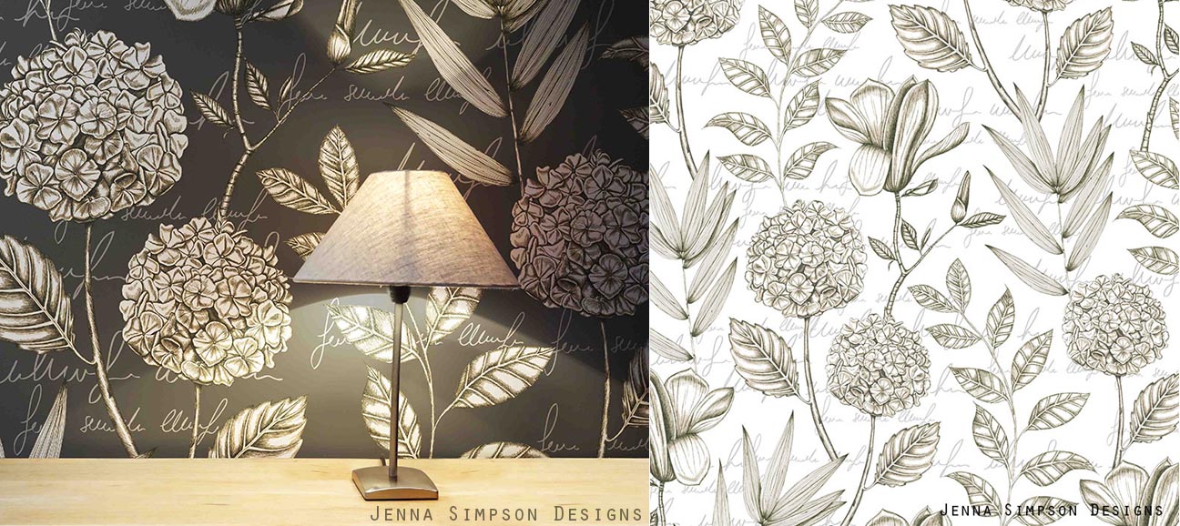
I also wanted to use the pencil sketches that I scanned in, and the traditional botanical writing. I feel that this is working well in the image below, as I have used the white, solid sketches to overlap the watercolour images, giving a contemporary twist to a traditionally inspired design.


I have also been creating more drawings using pen to draw with rather than pencil and watercolour.


I think the green background of the design above will fit into the rest of the collection well, but I am concerned that the style might not suit. I could therefore create other design that is similar to this to bring the rest of the collection together if this is the case.

I also tried to create a watercolour effect in the background of the design below. However I don't think the design is successful as part of the rest of my collection, as the style looks completely different.


I preferred the designs (below) which involved all four different plants that I drew as there is more to look at within the design. I also felt that adding text in the background helped my designs to link more to the rest of my collection. However, I felt that the white design would probably fit into the rest of my collection the most. This is due to the text in the background, but also because the images look less graphic as the background colour is the same white as the imagery.

My context for this collection is similar to that of companies such as Osborne and Little, Harlequin and in particular Marimekko. I feel that Marimekko's prints have an impact due to their size, and they also digitally print their wallpaper onto varying widths of paper, which is exactly what I intend to do with my designs. As well as selling through their own site they also stock companies like John Lewis. This production method and scale mean that their wallpapers are specialist, designer products, and this is why I think my work would fit into the same market. 

Marimekko

I am really pleased with the developments over the past few weeks. Although it has taken a long time to do the drawings, I feel that it has made my designs a very high standard. The only problem I will have is that I can only use an element in one design. It will therefore be hard to chose which design or designs to take forward for my final collection. As I am finding this decision hard, I might look back at it in a few weeks time, and might have to redraw some elements if I want to include the design in my final collection.

Tuesday, 3 February 2015

Developing Surface Pattern designs

This week I have had the opportunity to develop my surface pattern designs further along side visualisations.


I am really pleased with some of these prints as I feel the scale is working well, along with the colour and content. Although I was worried that my concept was hard to explain and get across in a print, I feel that these prints are successfully representing data. To enhance this idea, I have named individual designs with the moment that the data was taken, such as winter woodland.


When starting to look at the prints together, I started to notice that certain elements stood out from the rest of the collection, for example the typography in the print above. I do like the typography but in Unit X I might consider adding it into more than one design so it works well over the whole collection.


I also spent time this week taking photos of objects for visualisations to help bring my products to life. I am happy with these but in Unit X I feel I could produce stronger images that set more of a scene. For example a set of stationery, or a pile of presents.


I also started to see that some prints (e.g. above) have the potential to develop into a christmas collection in Unit X. I feel that this would also be good for my portfolio, showing I can work to realistic breifs.

Tuesday, 27 January 2015

Surface pattern designing

This week I have been getting back into designing for the surface pattern part of my project. I decided when I divided my work that I wanted to work with data for the surface pattern aspect of my project. After having a break whilst working on my botany work, I now know that I want my prints to represent the data I have collected from a specific moment in time.  After looking at how other people represent and collect data, I realised that I didn't want my prints to look like mathematic data as it wouldnt suit my target market, which led me to the idea of making my print a way of representing data, or a moment in time. I am therefore going to collect or draw items at different times and locations, and turn these into prints.

I had already been doing this sort of data collection throughout the project, but this week I took the opportunity to document more objects around me. I started at the bus stop that I use to get to university, and also went on a woodland walk. These have produced good drawings but I feel that in the next unit I can gather more data using more varied locations. This will also end up producing more interesting prints.


When I placed these motifs into photoshop I created a number of prints to allow me to experiment with the motifs to their full potential. This resulted in producing more than one print that had the potential to be a final design with the same elements (shown above). Therefore in Unit X I could recreate a similar print after drawing new motifs.


Next week I want to create more prints with different elements so I can see how the collection might function as a whole. I feel that to enable me to see which prints are working best, I need to take some photos for visualisations, which I will complete next week.

Monday, 26 January 2015

Designing Botanical Wallpapers

After spending two weeks creating detailed botanical drawings I had enough material to create designs this week which are shown below.


When I started to assemble designs, I soon realised that scanning in my drawings at the pencil stage and the watercolour stage was really useful for the design process as it allowed me to build up layers of line and solid imagery. I feel that the different styles of layout, from organised to scattered are working well and are giving a breadth to my collection. I also used many drawings of the same plant to create more detailed prints including buds, stems, cross sections of various parts of the plant and writing (as is used in traditional botany illustrations). I also feel that the context and layout of these prints reflects my concept really well.


Some designs were simpler with just two colours, and the Echinacea design above worked really well, as it also had a linear quality that would work well for wallpaper. I feel this contrast could add a nice variety to my collection.


Creating visuals as I designed helped me to see how the scale of my designs were working and also gave me more inspiration for other designs. I now feel that the way I am working to create my designs is working really well for me. For future designing, I will bear in mind that plants with flowers produced better prints, due to the different qualities to the drawing such as colour and shape.

Tuesday, 23 December 2014

Practising repeat in Illustrator

My main aim this week was to create a selection of wallpaper repeats based on the drawings I completed last week. After having a workshop based on repeat in Illustrator I also wanted to get to grips with how this works, as its a large part of my learning agreement, and I believe it is a very important skill to learn. 

To make it easier when learning more about the technique, I looked at a design I created a few weeks ago, and tried to replicate this in repeat. I encountered many problems, such as file sizes being too large, and the normal hiccups when using Illustrator when you're not used to it, such as how different the interface is from Photoshop, and rasterising and tracing images. However I feel that the design below is starting to look like a successful repeat.


After getting to grips with the process I felt confident in trying to create new patterns using the elements I created last week. As mentioned in the last post I wanted to create designs that resembled the botanical nature of my research, and I feel the print below achieves this due to the writing and layout of the flowers. I chose to use writing that wasn't actually a word so that it didn't detract or distract from the design itself and I feel this is working well.


I also changed the backgrounds to involve patterns such as the example below. I really like how this example turned out as I feel the colour is working well, as well as the scale (taking the time to make a visualisation helped me with this). I am concerned that the colours aren't looking like the palette I created for the collection, but as I like the designs I will see how the rest of them develop and consider whether to change my palette at a later date.


Now that we have finished for christmas, I will probably work on some surface pattern ideas and designs over the break to bring back in January.

Tuesday, 16 December 2014

Botanical wallpaper drawings

After last weeks tutorial I realised that it's okay to commit time to completing complex large scale drawings. After developing my mood boards last week, I wanted to spend this week developing some drawings for my wallpaper collection.

I drew 4 flowers on A2 sheets of paper using methods I used when researching botanical drawings (pencil and watercolour). The type of flowers that I drew also linked back to the science part of my brief as each flower had medicinal benefits, such as the echinacea treating cold and flu. I drew them with the intension of putting them together into one arrangement, however in the future I might consider drawing leaves, flowers and stems separately to assemble on the computer to allow my drawings to be even more flexible.


The drawings took up most of my time this week, however I did have time to arrange them into a half drop repeat shown below. I think that the colour is working well, and I am also pleased that I managed to create a good repeat.


Although I like the result, and I could see it working well as a wallpaper, I feel that playing with different backgrounds could add another element to it. I also want to try arranging the elements in a more botanical way, possibly incorporating writing like traditional botanical drawings.

To help with designing my wallpapers I also created a few boards of wallpaper research and contextual research (one is shown below). These have allowed me to focus my attention on specifically who I am designing for, and I feel the next stage of designing and drawing will be even more focused.

Sunday, 18 May 2014

Final Collection.

For the last few days of this project I have been putting together my final collection. I am really pleased with the final designs, and I feel that they represent my progression work and initial brief really well. I have ensured that a variety of my ideas, concepts and processes are represented within the collection, such as watercolour, felt tip, fine line and floral studies. I have met the clients brief perfectly, producing lots of drawings, and keeping a hand drawn feel to my final collection, not just creating a sea of photoshop files. I also wanted to ensure there was a variety of scales within my collection, by having some small and some large scale patterns. I also revised the collection as a whole numerous times to ensure the colour mood was perfect, and represented my colour palette.


As well as perfecting my final collection, I also created context images for each design to ensure that the client can see my design on the products it's intended for. From the start my context has been cushions, but as Debbie said she was also keen for me to bring my designs outdoors, I decided to adapt my collection to be suitable for garden furnishings too. This was also a challenge for myself as I had never designed for outdoors before, but I really enjoyed creating bright summery designs and context images, so I will definitely be doing this again! The images below are a handful of my context images, and they show how my designs are versatile and can be used for the home or garden.


Overall, I am confident that my final collection meets the brief Debbie gave us, and I believe that I absorbed all of the advice and feedback I have been given throughout the project to produce a strong collection and ensure the client is happy. This proves that I understand how design works in the professional world, and that I adjusted and adapted my approach to embrace this.