Showing posts with label Nature. Show all posts

Thursday, 9 April 2015

Developing the Moments collection

After completing a large proportion of my Botanical collection, I have started working on my surface pattern collection.


As my surface pattern work is based on moments in time, I wanted to make a print based on the pond in my garden, as I have always been fascinated by the amount of plant and animal life that inhabit it.


Some of the nature that I drew from consisted of plants, frogspawn, duck weed, lily pads, frogs, dragonflies and iris petals. The designs above represent the pond in the way I envisaged, however the colour isn't perfect, and I feel that the designs below have more potential, due to the good use of colour and composition. The Iris design would add a variety to the collection so far, and the dragonfly design captures the pond perfectly, corresponding to my initial learning agreement.


After visiting the Lake district over the easter break I wanted to use this as inspiration for my Moments collection as well. Whilst I was there I took photos and sketched things that interested me.


After drawing motifs to design with, I started to assemble designs. I think that the design on the left is visually appealing, however the vertical stripe is too strong, and it's too simple. The design on the right also didn't fit the brief as it doesn't convey the Lake District, however I feel that this is because of the colour use.


 The design below was based on Grisedale forrest and I am happy with the result, as it portrays the layering of trees on the hills, with a good use of colour and line.


I also really like the design below based on a visit to Grassmere because of the composition and the fact that it represents my visit. It also suits the products I am designing for well.


The context for the Moments collection is the high end of the highstreet. I can see my products being sold in companies like Paperchase and Selfridges. More specifically, the context for my work is similar to that of Anna Emilia and Khristian Howell. They both create and design contemporary, quirky stationery that sells on their own sites and through companies on the High street, such as Waterstones and John Lewis. The price range for these products is therefore between £5-£20, and is of a very high standard and quality. I therefore feel that my work fits this market because of the style of design, colour use and quality of final product. Creating visuals and doing a photoshoot will allow me to portray this to others as well.

Anna Emilia . Khristian Howell

Tuesday, 31 March 2015

Developing the Botanical collection

I have been continuing to draw and paint images for my wallpaper collection for a large proportion of this unit, in order to meet the requirements of my learning agreement. As they take a long period of time to draw, I scan them in at different stages so that I have a large quantity of imagery to work with. This is illustrated below.


Due to the amount of time that these illustrations take, I plan out drawings before hand to ensure that I will be able to use them in a design. As well as creating the design I planned originally, I also designed other potential wallpapers, some of which are shown below.


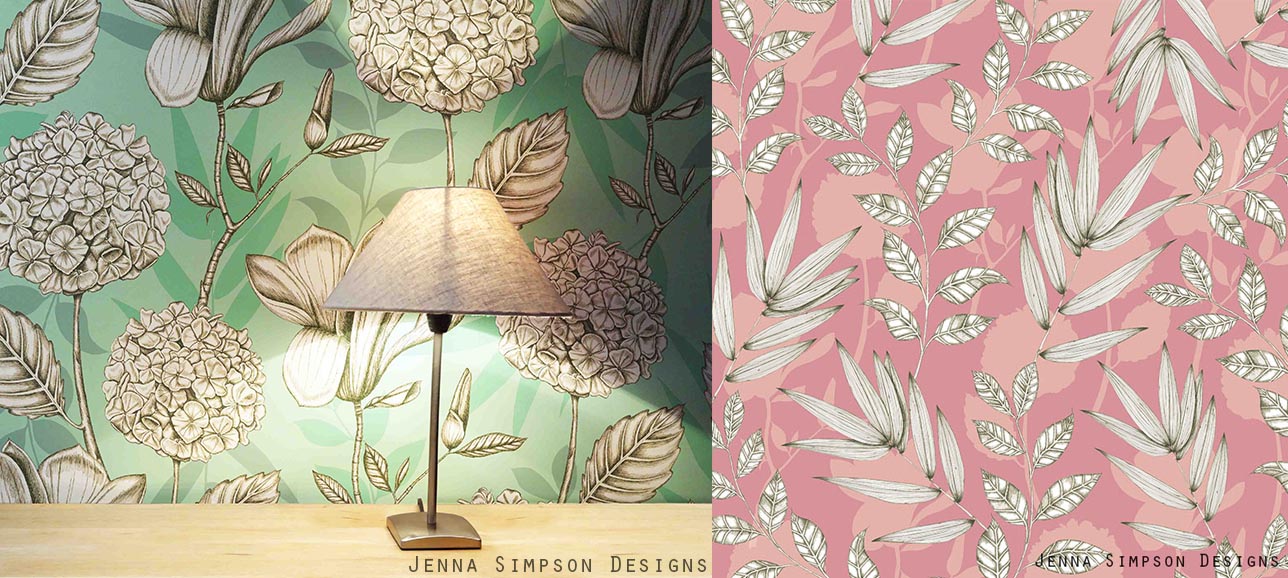
The elements that I have been drawing over the past few weeks have been meadow plants, so I was keen to get across that feeling of delicate, yet cluttered flowers. I feel that the prints shown get across this feeling whilst staying contemporary. I think they also work well because of the contemporary composition and colour.


I also wanted to use the pencil sketches that I scanned in, and the traditional botanical writing. I feel that this is working well in the image below, as I have used the white, solid sketches to overlap the watercolour images, giving a contemporary twist to a traditionally inspired design.


I have also been creating more drawings using pen to draw with rather than pencil and watercolour.


I think the green background of the design above will fit into the rest of the collection well, but I am concerned that the style might not suit. I could therefore create other design that is similar to this to bring the rest of the collection together if this is the case.

I also tried to create a watercolour effect in the background of the design below. However I don't think the design is successful as part of the rest of my collection, as the style looks completely different.


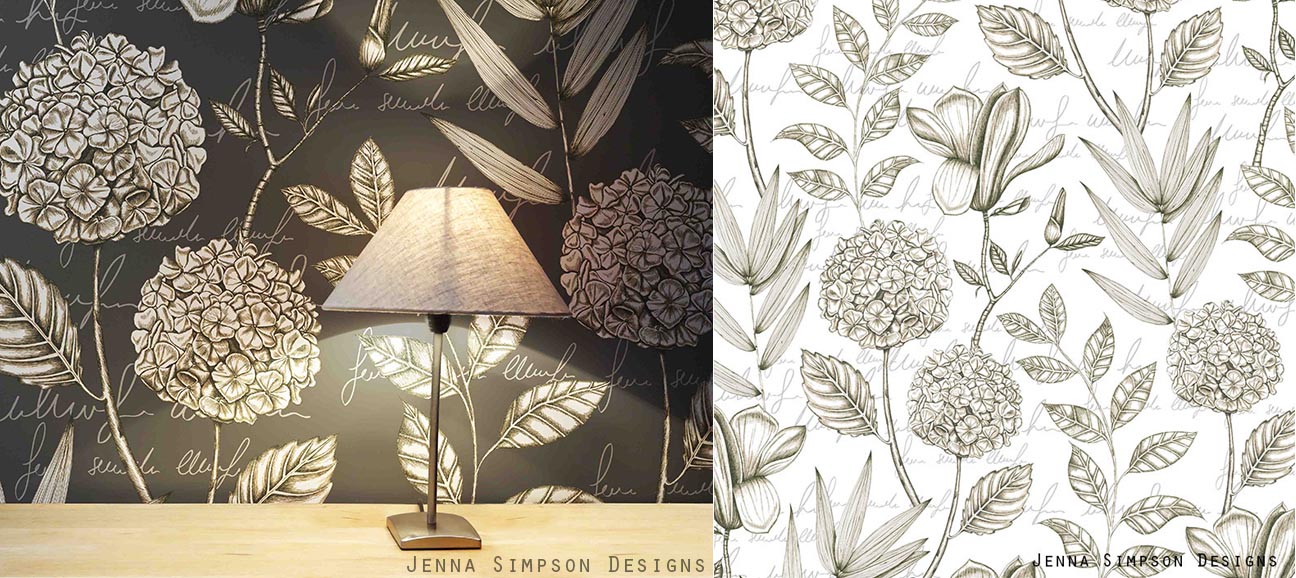
I preferred the designs (below) which involved all four different plants that I drew as there is more to look at within the design. I also felt that adding text in the background helped my designs to link more to the rest of my collection. However, I felt that the white design would probably fit into the rest of my collection the most. This is due to the text in the background, but also because the images look less graphic as the background colour is the same white as the imagery.

My context for this collection is similar to that of companies such as Osborne and Little, Harlequin and in particular Marimekko. I feel that Marimekko's prints have an impact due to their size, and they also digitally print their wallpaper onto varying widths of paper, which is exactly what I intend to do with my designs. As well as selling through their own site they also stock companies like John Lewis. This production method and scale mean that their wallpapers are specialist, designer products, and this is why I think my work would fit into the same market. 

Marimekko

I am really pleased with the developments over the past few weeks. Although it has taken a long time to do the drawings, I feel that it has made my designs a very high standard. The only problem I will have is that I can only use an element in one design. It will therefore be hard to chose which design or designs to take forward for my final collection. As I am finding this decision hard, I might look back at it in a few weeks time, and might have to redraw some elements if I want to include the design in my final collection.

Monday, 26 January 2015

Designing Botanical Wallpapers

After spending two weeks creating detailed botanical drawings I had enough material to create designs this week which are shown below.


When I started to assemble designs, I soon realised that scanning in my drawings at the pencil stage and the watercolour stage was really useful for the design process as it allowed me to build up layers of line and solid imagery. I feel that the different styles of layout, from organised to scattered are working well and are giving a breadth to my collection. I also used many drawings of the same plant to create more detailed prints including buds, stems, cross sections of various parts of the plant and writing (as is used in traditional botany illustrations). I also feel that the context and layout of these prints reflects my concept really well.


Some designs were simpler with just two colours, and the Echinacea design above worked really well, as it also had a linear quality that would work well for wallpaper. I feel this contrast could add a nice variety to my collection.


Creating visuals as I designed helped me to see how the scale of my designs were working and also gave me more inspiration for other designs. I now feel that the way I am working to create my designs is working really well for me. For future designing, I will bear in mind that plants with flowers produced better prints, due to the different qualities to the drawing such as colour and shape.

Tuesday, 25 November 2014

Responding from what I learnt during Review week.

Putting together the presentation for last weeks review helped me to see which parts of my practice I enjoyed the most, and made me realise what I need to do before the end of the project. This week I have therefore been doing more development drawings based on the work I have done so far.

The anatomy part of my project has really inspired me ever since I did it, and I also enjoyed producing more abstract work a few weeks ago so I decided to mix the two together. I therefore produced abstract paintings of the cross sections of my own flowers. Overall I didn't like the paintings as I felt they looked childish, but when photographing sections of my work, I realised that they became more abstract and more focus was on the marks an brush strokes rather than the overall painting.


I also thought that my prints were working well, and the idea of creating a print out of lots of elements from one flower worked well along side my learning agreement. I therefore created new work based on a Lily, using the parts to make marks, drawing it, and using the pollen to paint with.


When painting with pollen, I added a little water to make it a liquid but it turned into a really sticky substance that ruined everything that I was using, and was really hard to work with. I think the idea of using pollen could develop further into possibly printing techniques such as screen printing. However I will need to try it out when mixing with manutex, as it might not work at all. This might be a task for after Christmas or in Unit X. I also intend to make these into prints made from just Lily's.

The review also made me realise that I need to try different compositions for my prints, possibly linking them more to the research I completed at the start of the project.

Tuesday, 18 November 2014

Review Week

This week was review week, and we had to present our work so far in powerpoint form to two tutors and a group of our peers. I used the opportunity to reflect on the work I have done so far and see what parts of my work need more research or more development.

A key part of the presentation was establishing our context. My work for this project is for a surface pattern context, and I am considering four main product areas; wallpaper, stationery, giftware, and soft furnishings. At the moment I can see these dividing into two collections, of a larger scale and smaller scale. The decision to do this has been inspired by my two placements at Tigerprint and Digetex, as well as some key contextual influences.

Rachael Taylor is a surface pattern designer who designs for a large range of products including lamp shades, duvets, throws, cushions and wallpaper. As well as being inspired by her work contextually, I also love her drawing style as it stays hand drawn and quirky.

(Images from Rachael Taylor Designs)

As well as being inspired by designer makers, larger companies like Paperchase also inspire my practice as they have ranges of patterns that are produced across a variety of products such as gift wrap and stationery.

(Images from Paperchase.com)

Compared to Rachael Taylor, they have much lower prices as they are a high street brand. At the moment I am not sure whether my work will be aimed at high end or high street products

As well as examining my context, I also visited a Close up Exhibition at MOSI. It consisted of microscopic images of natural forms which I thought would give a good twist on the work I am doing at the moment.

Image from Come Closer Exhibiton

The geometric nature of these images lead me to think about butterfly wings, and other geometric shapes found within nature. I therefore gathered some first hand research at a zoo and completed some drawings of the patterns, with the intension to mix these patterns with some watercolour based paintings at a later date.


Tuesday, 11 November 2014

Design Experimentation and Development


For me, this week was all about developing the drawings I have been doing into ideas and designs. Sometimes this was just placing different elements together to see what they looked like, and some developed into design ideas.

I started off by defining my colour palette which is inspired by natural and scientific elements, as well as colours that I like. I have enjoyed working with the colour palette but to improve it, I feel that I need two different palettes or colour directions for me to experiment with (such as bright and tonal). I will bare this in mind when working on drawings and designs in the future.
Colour Palette Development

I started by experimenting with some of the large scale shadow drawings that I have completed, and I like the design below as there is a good contrast between line and shadow. I also like the fact that it involves the shadow and contour line drawing of the same plant, so both elements have come from the same source yet look totally different. However, I after using the larger scale shadow work in my designs, I dont feel it does justice to my concept and the ideas I have had throughout the project. I therefore might use the data ring idea with other elements to make a stronger print: the larger scale work might be something I could pick up again in Unit X.

Shadow and contour line print experiment

I also mixed up some painted elements to create a traditional style print with a modern twist. I like how each element works well together, with the paler silhouette in the background, and the bold flowers. I think if I created more similar, but smaller motifs, they would all make a good repeat pattern too.

Experiment with gouache flowers

I also wanted to keep some prints simpler, using just a few colours, and I am pleased with the print below. I like that this print represents the taxonomy, and data collection part of my project, as all of the elements were collected on the same walk. I think I could experiment more with the way I arrange these, possibly bringing in the botany element from my work so far. 

Print based on collection of natural elements

Finally, I also like these two prints below because I feel that they are starting to become more original and different to whats already out there. I feel that the mix of hand drawn, graphic, textural and solid colour work well together and I wish to develop this with my next set of designs too.


I am really pleased with my design development and I feel that this will now help me to focus my drawings as I know the kind of designs I want to create. 

Tuesday, 4 November 2014

Tree ring data and going even bigger!

This week my main focus was to go even bigger scale than I did the week before with my shadow drawings.

I created paper that was up to 1.5 metres by 1.5 metres and pinned them up on the wall for me to draw on. The way I chose what I was drawing linked back to my original brief based on data collection, as I went and collected 5 objects from my garden that had 2 colours in the leaves. Using these I then created my own experiments in 10 minutes using a variety of tools and media.

I am not sure whether I like the results as I feel the paintings look rushed and bad quality rather than loose. However my favourite painting is the one below, because I like the way the two colours of paint mixed whilst I was painting.

Large scale shadow painting experiment.

Another task I set myself this week was to look at ways that data is found and recorded in nature. I came across tree rings which hold a variety of data for each half year of a trees life, meaning scientists can look back into the past to find out what weather conditions, and various other factors, were like years ago. After doing tree ring drawings I decided to make concentric circles inside and outside of the outline of a plant. I thought these were effective and have the potential to be part of a design.

Concentric tree ring data drawings

I then combined these two ideas: paint mixing on the surface, and tree ring data. I also wanted to illustrate both the inside and outside of a tree, so used the mixed paint to represent bark patterns, and added the line to illustrate the tree rings on the inside.

Tree ring, bark and mixing paint.

I felt that this small painting was quite successful as it got across both elements and I like the contrast between line and mixed paint. I have also realised that I am at the stage where I need to establish a few colour palettes to work with so that I can start to develop my work with colour. However, I feel that this style of work wouldn't suit my target market based on the research I have done, so this more abstract style might be something that I could pick up on in Unit X.

This week has also shown me that I should look over my learning agreement again. I stated that I wanted to look into science and nature, but now I have realised that it is data, rather than science, that I am interested in investigating. I intend to edit this next week.

Tuesday, 14 October 2014

Anatomy and Time

This week I started off by looking at a book called 'The Anatomy of Flowers' by Arthur Harry Church. It is filled with intricate drawings of cross sections of flowers (such as the drawing below), some of which looked like expressive shapes rather than flowers.
Scan of drawing from 'The Anatomy of Flowers'

I began by painting accurately the drawings from the book, and also drawing the parts of the plant that interested me most. However the most successful part of this exercise was when I scanned in one of my drawings and cut it into the main shapes of the flower, rearranging it into another shape. This collage idea worked well for me as it created an imaginary shape that I wouldn't have drawn if I tried to draw normally: I will bare it in mind for other drawings that I complete. 

My Collage made up of my original drawing based on the anatomy of flowers.

This week I also collected seed heads from Hogweed and drew them at different stages in time, from being alive and flowering, to having seed pods, and being dead. Whilst drawing all of them in different styles, one drawing inspired me to create these drawings below. I illustrated how many flowers/buds/stems, each seed head had with a key, which I thought linked back to representing data very well. 

Data drawings from Hogweed seed heads

I also came across an artist called Marisa Redondo this week who creates lovely drawings for a similar context to what I want to make designs for. She has a brand called River Luna, and her work can be found at http://www.riverlunaart.com. 

River Luna Artwork -- https://www.etsy.com/uk/shop/RiverLuna

I love the way that she uses painterly effects and line, and creates tone (even through thin lines). I wanted to explore the way that she creates her designs, so I have been recreating the way she works so that I can be inspired by the techniques and methods she uses.

My response to artwork by River Luna

I tried creating the designs using various methods, but the most effective are the designs above, created digitally from a watercolour painting and a fine liner drawing. Although I didn't get quite the same effects as Marisa creates with her paintings, I have taken on board different ideas and techniques, including filling abstract shapes with loose watercolour, and experimenting with fine lines on top of this. I intend to develop these in my own way next week.

Tuesday, 7 October 2014

Botany and Data Collection

After my first tutorial on Tuesday with Alex, I have spent the last week looking into Botany as a way of representing nature scientifically.

Botanical Drawing of Oak branch - www.lizzieharper.co.uk
I looked at botany books from the library to study how botanists drew, including their use of composition, media, language and subject matter. I produced a few drawings in response, looking at plants that were beneficial to humans, such as he crocus which is thought to contain a cancer cure. I realised that most botanists drew tonal drawings in pencil and then painted over their drawing, and left some areas in black and white to emphasise the area in colour which I felt worked well. I felt that the Cone flower drawing below was the most successful, as loved experimenting with watercolour on top of pencil, and I also thought that leaving some areas without paint worked well. I used the paint to emphasise the bits of the flower that I thought were most important

Cone Flower drawing inspired by Botany illustrations

This drawing also lead me to think about the anatomy of flowers, due to the cross section at the bottom right. I have found an amazing book in the library called The anatomy of Flowers which has massively inspired me. I am looking forward to getting the chance to explore this next week.

Anna Gillespie Sculpture made of Acorns

This week I was also inspired by Anna Gilespie after seeing one of her sculptures at Artzu. She uses materials that nature discards which seem meaningless. I decided to draw some of her subject matter, as well as taking this as an opportunity to collect my own ' scientific data' on my walk into University. I passed 3 beech trees and collected seeds from each, drawing their different colours and mapping them as I went. Although this seemed like a small task at the time I think the idea of representing data naturally has a lot of potential and I intend to develop this further as a result.

Sketchbook page about collecting Beech Seeds.

As well as drawing beech seeds, I decided to collect other materials discarded by nature and draw them in a botanical way, linking both elements to my work this week. I used different media and paper to experiment, and I thought that the different sycamore seeds on the black (below) worked particularly well, as it's striking and the colours stand out. The drawings below also represent how nature changes over time, as the Hosta leaf has started to decompose and the top sycamore was dried out, linking to the idea of representing data mentioned in my learning agreement.

Sketchbook page: Decomposing Hosta leaf (left) and Sycamore seed collection drawing

This idea of using time as a way of collecting data could be developed next week, along with looking further into the anatomy of flowers.