Showing posts with label Origins project L4. Show all posts

Tuesday, 27 November 2012

Evaluation of Origins unit

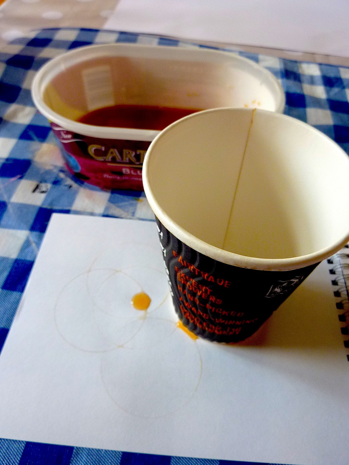
My first project at university has really opened my eyes to the wide range of possibilities that I can explore in the world of Textiles. I have really enjoyed print, and also exploring my theme of Journeys so thoroughly. In the first few weeks, I was looking everywhere for inspiration, taking my sketchbook on the bus, and walking home with it to make the best observations possible. I think this added a real depth to my work because I had a lot of material to work with, so I could experiment with motifs and ideas, picking and choosing the good ideas to develop onto prints and on the computer. I felt that at this stage in the project, my links between practice and research were very strong and my sketchbook told the story of how I was working. I was also impressed with how I pushed myself to think laterally. For example when I was going down the route of observing litter, I decided that the shape was too ‘ugly’ to put on a print between leaves, but I didn’t want to just neglect this idea as I wanted to explore the connection between litter and nature. Instead I looked at patterns that litter could make, such as the coffee stains of a cup, which then translated into the circles on my screen.


This print was inspired by mushroom patterns (small circles) and coffee cup ring stains (larger circles)

The zigzag lines in the background of this print were created by the jolting movements of the bus

The background pattern for this was also inspired by the pattern on mushrooms 

All of these patterns show lateral thinking and I have enjoyed pushing myself to do this as I haven't done anything like it before.

However, in the later few weeks of the project I unfortunately relaxed with the research, which I was aware of doing, but I didn’t intend to. I ended up being in the print room or the computer room all the time and found it very hard to keep up with primary research when I felt like I was in such a flow with the ideas that I was already working with. I will definitely change my approach next time, to constantly feeding my work with primary research. I also feel as though a constant reference to galleries would have helped. At the start I frequently visited galleries but towards the end I primarily used the Internet as a source of information, rather than going to galleries. After exploring the library more towards the end of the project, I found it really useful, but for the next project I will use this as a constant source of information too, to enrich my study.

For this project I felt as though I played safe with my theme: at the start of the project I was trying to force myself to come up with exciting ideas but I decided that I should stick with what I know for the first project; nature. I am used to using natural form, but next time I'd love to find a way to push myself to produce something more exciting and challenge myself more.

Throughout the project I have tried really hard to balance my studio and workshop time with my work at home. It’s been particularly important for me because I travel into university, so I need to make sure I plan my time wisely, and although at times it's frustrating, I think the routine has really pushed me to achieve to the best of my abilities.

Monday, 19 November 2012

The end of my Journey...


Today was the deadline for the Journeys brief. I have thoroughly enjoyed getting to grips with print, but I am also so relieved that my first project has finished. Here is my final display, showing my journey through the project. I can't wait to start the next project!

Wednesday, 14 November 2012

Digital Printing

Concluding the selection of photoshop work I have done over the project, I am sending some of my designs to be digitally printed. After last Thursday's digital session involving creating backgrounds from textured backgrounds and photos, I have really enjoyed developing my designs; before this I felt they were too plain. With the addition of the interesting backgrounds I am hoping that they will form a good set of digitally printed designs.


They are being printed on silk viscose which is smooth and thin. This should compliment my designs well due to the slightly transparent effect it will give, so the colours aren't too bold.

I would like to take the design on the bottom right into the print room and try printing on top of it, but I think that the pigment dyes are too transparent to stand out on the background. I therefore think that the photo and textured backgrounds would be good to take into the print room with the correct dyes, or if they were paler to put the pigment dyes on top of.

Monday, 12 November 2012

Last print room session

After my last day in the print room, I have tied together all of my samples to collect a good body of work. As part of today I tried to fix a few samples which I felt didn't go so well to start with. I still don't think they are fixed but I have experimented to find out what does and doesn't work.

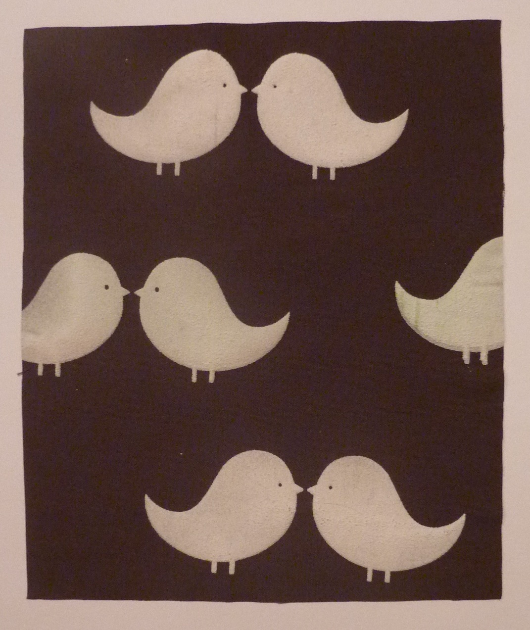
This print was supposed to look like leaves were falling, with the gradient background and the leaves getting bigger towards the bottom. Unfortunately there were quite a few smudges on the print so I added aquaspand leaves to try and distract from this. I think if done well this concept would be effective.
As previously mentioned, this sample didnt work for many reasons, so I  decided to try and add in some darker leaves  to the background. 
This sample was done from half of another sample. After cutting it in half, I painted on a beige pigment dye for the background and added some green leaves to see what effect it would have. I think its added to the print, and I definitely prefer the coloured background to the white one. I also think it represents my colour stripe more as a sample.

 I also started two new prints which are shown below. The left sample was an experiment because I painted reactive dyes directly onto the wet fabric to see what effect it would have. I am happy with the result because I think it represents the colours in an autumn tree which is exactly the effect I wanted, for this print and my whole project. The left print was my first attempt at monoprinting on my exposed screen. As it was my first go, I wasn't too sure what to expect but I did 3 attempts using the same painted screen. The first didn't come out properly, probably because the dye wasn't wet enough or there was too much of it, but the colour that did come out was nice and strong. The next two did come out properly but the colour gradually faded. I love the monoprinting technique and wish I had more time to experiment with it.


I have loved my time in the print room, and I had lots more ideas that I didn't have the chance to develop. This included painting on an open screen because there were none available to paint on, and placing things like doilies, lace and thread under my screen before printing to see what effect it would have on my prints. This would have worked particularly well on my birds due to the density of colour. It also would have linked really well to my sketchbook as some of them were worked into with pattern when I was doing my research.

Saturday, 10 November 2012

Reactive dyes

After experimenting with Pigment dyes for the past few weeks I have decided to try an alternative method; reactive dyes. I have found them much harder to mix because of the more complicated processes, but I like the fact that they don't sit on top of the fabric, so therefore you can't feel the dye. 


I am happy with the sample above, however the underneath sample had problems with the dye seeping into the surrounding fabric. I thoroughly washed it, yet the dye still spread and left yellow circles on my fabric. I think it was due to the thickness of the cotton, which was as thick as denim.


At the moment I still prefer working with pigment dyes but when I get used to the processes I think reactive dyes will suit my style of working more as I prefer working on thinner fabrics where the pigment cant be felt.


Friday, 9 November 2012

Aquaspand samples

Throughout this week I have been experimenting with aquaspand, or puff binder. The first experiment I did was not successful which put me off slightly. When I printed, I covered the wet elements with paper to prevent them smudging and transferring to other parts of the print. However, with aquaspand it simply removed the binder meaning it didn't puff up when heated. A leaf from this print is shown below.


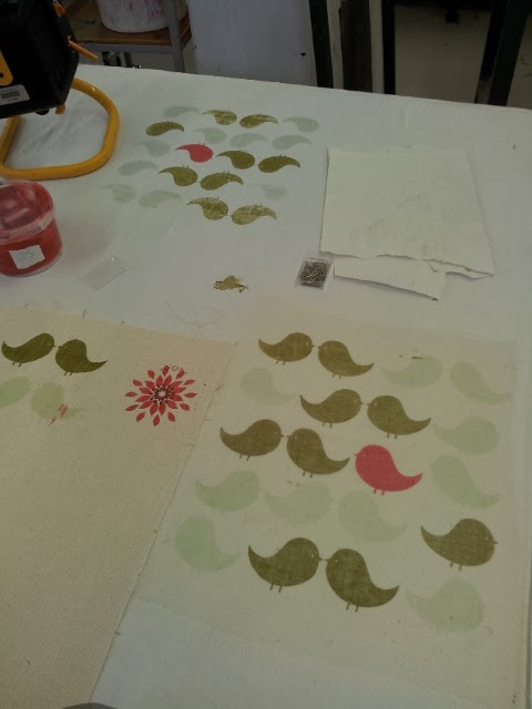
Finding this out, I found it hard to try out complex designs because it was too time consuming. In the sample below the binder puffed really well and didn't crinkle the fabric. For the middle birds I added a hint of green pigment to see what effect it would have. I think the addition of green showed a bit, but next time I might add more to make a stronger contrast.


The next sample was a similar idea however it was done on a basket weave fabric which introduced a very interesting texture to the puff binder.


This sample was done on a much finer fabric and the Aquaspand added to the pattern that I had printed in the background


Wednesday, 7 November 2012

Dyeing

Yesterday I dyed my first fabrics in preparation for a session in the print room tomorrow. I used reactive dyes and the fabrics were old bits and pieces that I found around my house. The samples below were created using an old pillow case.


I experimented with 2 colours, a brown and an orangey red, to see what different results I got.

The samples below were done on an old thin curtain/blind.


After using reactive dyes in the print room on monday, I knew that the dye wouldn't stay on this fabric very well, as my other sample washed out. But I wanted to see if they would take some colour to give a pale background. After leaving them in the dye baths for about 5 minutes this worked, and I am happy with the results. 

Tuesday, 6 November 2012

Peer review


So far this week I have been putting up my work in preparation for a peer review this morning. I found the process really interesting, both looking at other peoples work and getting feedback on my own. The feedback on my work was as follows:

  • Strong development - mood board and mark making are very good
  • Very thorough work
  • Used colour palette very strongly
  • Research is original
  • Strong fabric design - good quality work/samples
  • Maybe experiment with a few more colours in colour stripe and translate into prints
  • Exciting digital prints but they don't feel as connected to my original work as my screen prints
I found this feedback very valuable; it was nice to know that I was on the right lines but it also pointed out some facts that I wasn't aware of, such as the connection of my digital prints to my original work. I will definitely be developing my digital prints, concentrating on linking them back to my work more, for the rest of this week.

Putting up my work also highlighted to myself which areas of my work I needed to develop. I feel that I need some stronger designs on photoshop, and I also need some samples of screen printed fabrics that contain a higher density of colour. I will therefore dye the backgrounds of some of my fabrics this week, ready for printing.

Friday, 2 November 2012

Print room: episode 2!

Yesterday was my second day in the print room and I produced a few more prints. I also managed to mix some more colours to compliment my work, and I used a binder called aquaspand which makes the fabric puffy. I tried out different techniques and used my initiative to think of ways to help me when screen printing, such as using a hard spatula rather than a big squeegee for small areas, and using masking tape and paper to make masking my screen off easier.


One technique I tried, shown in the background of the left picture, involved painting my binder straight onto the fabric to colour it, rather than using a blank screen or dying.

On the samples below, the white, small leaves and birds are done with aquaspand which has a 3D texture. I found it quite hard to work with as you have to leave each motif to dry between prints otherwise some of the aquaspand comes off so it doesnt puff up. This is what happened on the leaf sample below, as I covered each leaf with paper between prints, which just took off the aquaspand.


I'm quite happy with the selection of fabrics that I have produced, and next week I would like to try printing onto fabrics that I've dyed myself and also using reactive dyes.

Wednesday, 31 October 2012

First day in the print room is underway!

Today was the first day that I ventured into the print room. I was very nevous but excited at the same time to see what I could produce and no doubt see the mistakes I knew I'd make. I kept telling myself that it was a learning experience and I would eventually get better to keep me going through the day; although that was hard to believe.

The first thing on the agenda was to mix some dyes that matched my colour scheme. I decided to stick with pigment dyes to start with because they seemed easier to make, however I struggled to make colours accurately. I ended up making 6 colours but I found the browns the hardest to mix.


After preparing my workspace I decided to start printing on the range of fabric samples that I had recently bought. I found it hard to mask off my screen correcrly at the start, but after a few mistakes were made I really grasped it and by the end of the session I'd produced my first two prints!!


Saturday, 27 October 2012

My first exposed screen!

Yesterday I decided on the motifs that would be going onto my screen. I arranged these so that the space could be used effectively whilst having a selection of motifs to work with. I also kept some motifs together so they could be used together when printing, for example the two birds and the line of leaves.


 We were asked to print these out onto A3 acetate so that they could be exposed onto a screen. 


This is what the screen looks like now that it has been exposed and I'll be using it in the print room next week to create my first fabric samples.


Thursday, 25 October 2012

Colour Scheme!

For this project I wanted to achieve a sophisticated autumnal look. I had to chose a picture and represent the colours proportionally on a colour strip to create my colour palette. This would then create my colour scheme and to my surprise, no pictures of autumnal scenes or leaves had the right colour balance, they were all too bright, orange, green or dull. The picture I chose in the end was from a cookery book, and here are the results.


Above is a moodboard which I made to help me with my autumn theme.

Tuesday, 23 October 2012

My first motifs on Illustrator

This week I have been working out the basics of Illustrator. I used my hand drawn motifs as inspiration to create my computed ones. To start with I designed some basic bird and leaf shapes.


I then tried to replicate the hand drawn qualities of my mark making motifs on the computer which involved experimenting with the different textured brushes and line tools.

The next idea that I tried was combining my solid black motifs such as birds and leaves with the mark making motifs to create patterns inside the motifs.


I loved this idea as it joined all of the elements together, however I decided that for my final screen i'd separate the elements so that I could layer them using different colours, or use the elements separately, therefore not restricting the possibilities in the print room.

After learning the basics, I tried to create a composition with the motifs I designed using colour to get an idea of how they would develop in the print room. This should hopefully lead me to making decisions about which motifs to put onto screen next week.

Wednesday, 17 October 2012

Mark Making!

This week I have been very busy creative motifs ready for screen printing. As part of this I have tried to explore relevant forms of mark making. I have used objects that are relevant to the theme of my journey to do this with, including litter and leaves.


The motifs in the picture above were created in a variety of ways. For example, the circles in the bottom right of the picture were inspired by coffee cup stains. 

As I have been concentrating on litter in my journey so far, I wanted to experiment with incorporating it in a slightly less obvious way. I used a left over coffee cup from a morning in the studio dipped in ink to create some different shapes. I quite liked the unevenly distributed splodges of ink aswell which added some character.

The sheet in the bottom left of the picture was created by using leaves in a variety of different ways. Some marks were created from prints of leaves with ink on to highlight the venation. I quite liked the effect of this as it looked like a realistic leaf, however some worked better than others. I liked the simple leaf shapes' effect best as it was easy to see its shape.


Others were drawn with the stalk from a big oak leaf. It acted like a dipping pen and was quite successful, but it worked so well that it just looked like any ink drawing, and the implement didn't add any extra character. I will try a more flimsy stalk in the same way and see if this does create a different look.


Some others were drawn with the leaf itself which with the waxier leaves worked quite nicely, sometimes creating a double line which was a nice effect. However, flimsier leaves didn't create enough of a line, so weren't as effective.

Marks like the ones shown in the sketchbook page below were inspired by some toadstools that I found one day when walking past a nursing home to university. The scale of them really surprised me and I loved the colour and pattern on them. 


The circles on top of the toadstool are represented here, as well as the texture that the tearing of the mushroom created. The other two patterns were from other toadstools which had a less circular pattern on top.


Some of the other patterns that I have created were developments from the studies I did consisting of lines made whilst on the bus and walking. The circles are developments of the coffee stain idea, because I felt like they were too regular, where as these ones have a more hand drawn quality.


The remaining square based patterns are inspired by the fabrics on the bus that I travel on to university every day. One print is made up of brush strokes and the other is composed of prints from corrugated cardboard.

I think some of these motifs will compliment my other drawn motifs really well and the next stage will be to select my favourite ones ready to be developed onto screens.