Thursday, 16 May 2013

PE Task 2!


My first year of studying Textiles in Practice has provided me with a great breadth of knowledge in different areas of textiles, as well as expanding the ways in which I work, making me more open minded when it comes to exploring briefs. This year I specialised in print and embroidery, as I love pattern, surface texture and manipulation. So far I haven’t combined the skills which I have gained studying embroidery and print, but the idea of layering embroidery textures on top of prints excites me, and I’d love to experiment with this during the rest of my University experience. I have also undertaken Unit X which was a collaborative unit. I definitely found this unit challenging in terms of working with other people, but I pushed myself in all areas of the unit. I stepped away from textiles to try and explore new pathways in the art world, and I feel as though I collaborated really well when I knew my group.

My favourite area of Textiles in Practice so far is print, as I love working with pattern and colour and I feel as though I could fit into the commercial market well. I loved being in the print room, descovering dyes and pigments, aswell as learning about the diversity of digital prints. I aspire to become a successful pattern designer and I gravitate towards gift-wrap, stationary and interior pattern products on the market, so I feel as though I could fit into these areas well. I love print for fashion but at the moment I don’t think my skill set applies as well to this area. However I would love to take second year as a chance to develop these skills and further investigate which area of print I’d really like to specialise in.  This year I have had an introduction to Photoshop and Illustrator, but as I hadn’t used either of them before, I still need to push my development in these to make myself more diverse and allow myself to use different skills in the world of print.

A contemporary company that inspires me is Tigerprint, who focus on innovation and creativity which has has lead them to become the sole supplier of over 5000 greetings products to M&S. (Tigerprint website: 2013). Their designs contain great colour, and they produce the kind of work that I aspire to produce.


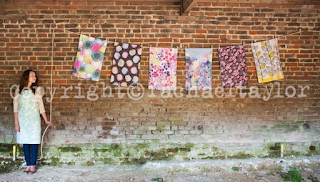
I also love Rachael Taylors signature style of layering, textures & quirky hand drawn linework. Rachael has designed for the art, ceramics, interior, fashion, textiles, greetings, stationery and marketing industries, which is definitely the kind of career which I aspire to have in the future; making patterns that can be applied to a range of products.


Therefore, during second year I hope to push myself, and develop new skills such as learning more about Photoshop and printing, to enable me to become a pattern designer in the future.

Unit X Evaluation!

Unit X has really pushed me out of my comfort zone: from working with different people, working in different locations, and working away from textiles, I have embraced the challenges and pushed myself as far as I could.

Throughout this unit, I feel that I have engaged most with the collaboration aspect of the task. I have grasped the opportunity to work with other students (FMS & TIP) with both hands, and I have made the most of having other people to talk and bounce ideas off. I attended every session to make the most of this opportunity, and have made an effort to get to know my group outside of the set timetable. I feel as though I contributed a lot towards the group, stimulating ideas and giving a direction for our collaborative work.

I feel that the strongest aspect of the project has been the underlying theme of Alice in Wonderland, which is an idea I generated in the first few weeks of visual research based on the number 175, (see previous blog posts). Although we all had our separate projects, having this theme to constantly feed the group with ideas has helped us to collaborate, talk about our work and engage with our final exhibition ideas.

Our group always had the idea to create a linking final piece on top of our individual pieces to emphasise the Alice in Wonderland theme, and bring together all of our work. Unfortunately all of the plans that we had were reliant on having our own gallery space so we could create an interactive environment. As Kraak Gallery doesn't suit our ideas, with such late notice we decided our efforts would be better concentrated on our individual final pieces. However in the future, I'd push this idea further and adapt our ideas to whatever space we are given.

Overall, I am very proud of my efforts, and my final outcome, but next time I would probably make more of an effort to create a collaborative piece harnessing the different skills from other people within the group.

Seeing the Exhibition!

After putting up my piece yesterday, I went in today to find the finished exhibition and it looked fantastic with everyone else's work in it! I am really happy with how my final piece turned out. I had a good position in the room and my cubes spun naturally due to the breezes from peoples movement. Because my space was so bright it was hard to cast shadows, but I did provide a labeled torch alongside my piece so people can cast their own shadows if its dark enough.


As a group, our Exhibition came together really well, we had pieces on the walls and the floor, and we had photos and installations. 


I also really loved looking around the rest of the exhibition to see how other groups had undertaken the collaborative brief of 175. I think the group called Action, (in Play) did a really good job of collaborating. They created these perspex triangles which all had each members art work on. I love the way their individual work came together as a vibrant and 3D installation piece.


I also loved this groups work. They created 'bricks' using yarns and wire, and placed them in an environment that was deteriorating, where bricks were missing. It created an interactive environment and I love the colours and textures. I also liked the way they worked collaboratively, as a few girls from textiles worked on this together.


Tuesday, 14 May 2013

Preparation for setting up the Exhibition tomorrow.

Tomorrow is the day that I get to go in to set up my work. Today I have finished my final piece and I am starting to think about the smaller details of how my piece will work together.


Above is a rough plan of how my piece is going to work. I am planning to suspend the cutout boxes in front of the missing words with invisible thread.

To link in with my shadow/enlarging theme, I have bought a torch to place alongside my piece some how. I have considered hanging it along side the piece with a tag (replicating the drink me label) saying "Light up the shadows" to give people a clue to see the swirling shadows created by the maze of each box.

Overall I am happy with the amount of boxes I have managed to do, as I think the piece has enough to it, without being so busy that it becomes confusing. As I used the words that existed on the page, this determined the layout. Without these restrictions, I would have used my own judgement on placing the boxes, to possibly create a more aesthetic layout. However, this method has allowed my final piece to develop in a more organic way, as I removed my control, which I think adds more character.

Wednesday, 8 May 2013

Final Idea!

Today I collected my A0 print of page 175 of Alice in Wonderland and I am very happy with the result. I now need to start assembling my final piece, but since receiving the print I have altered my plans slightly.

On the practice examples that I have done, the words I have used have been a lot bigger than the words are now, so now they're far to small to make decent sized objects from. I have therefore decided to enlarge the words that I am cutting out by 175% of the size they are on the A0 sheet to make the objects bigger. This fits in with both my enlarging theme and the 175 brief.

I'm looking forward to getting started!

Tuesday, 7 May 2013

Rebus Books

The definition of a rebus book is...
A puzzle in which words are represented by combinations of pictures and individual letters.
I like the way these puzzles become a piece of artwork which you have to think about as well as read, and I would like this to come across in my work. This has inspired me to take my work in a slightly different direction. 

Rebus Puzzle/book

"A bee came and stung his foot"

The work that I am doing at the moment involves cutouts of patterns on different shapes. As the cutouts I have chosen reflect the themes and imagery in Alice in Wonderland,  I now feel like I needed a reason to be choosing the 3D shape as well.


Final Piece Idea.

I now have a final idea which involves an A0 sized scan of page 175 of Alice in Wonderland. I will then chose certain words from the page and cut them out (in a rectangular shape) and will make a 3D shape from whatever sized word I end up with. I will then cut into this with a pattern or image based on what that word says. This way I will be creating my own kind of Rebus puzzle.

So far I have experimented with a few different ways that I could do this. I have found that cubes are a good shape to create because of the shape of the cutout word. I have therefore tried having the text on the inside and the outside.


The word for this cutout was 'Petals" but having the word on the inside made it very hard to read.
This cutout was inspired by the word "Rose" and as you can see, having the word on the outside has meant that it is a lot easier to see.


I have also experimented by not making a shape at all, and just cutting into the word.

This cutout was inspired by the word "questions" and I also decided to hang the question marks which I cutout from the piece too.

After experimenting with these ideas, I think the cubes with the text on the outside work best but I might combine the idea of hanging the cutouts from the cube if it applies. I still need to decide whether to do one shape and keep it constant, or whether to do lots of different shapes and ideas (as I need to ensure that it isn't too confusing).

The idea is therefore that you read the page as a form of rebus puzzle: as you go along the text you will see boxes which represent the word thats missing. The pattern and the faint text should help reveal to the reader what that word is.

Friday, 3 May 2013

Kraak Gallery!

Yesterday we all found out that our work is being exhibited at the Kraak Gallery in the Northern Quarter along with all of the Record and Play group! I am very excited to work in such a large open space with such a lovely structure, but unfortunately it means that my plans for a final piece and our collaborative piece plans have to change due to the features of the space.


For example as there is so much light in the gallery, the shadows are going to be hard to create so I have considered making a film to go alongside the piece, which will be taken in darkness. Also, as our group doesn't have our own room/space, its going to be hard to create an interactive space for our work as it wont be clearly separated, as mentioned in a previous blog post, (http://jennasimpson94.blogspot.co.uk/2013/04/beak-book-workshop-tonnes-of-ideas.html).

Now that we know this, we have more time to consider how we can arrange our exhibition in this gorgeous gallery.

http://www.kraak.co/home/

Wednesday, 1 May 2013

Lumen Lamps.

Lumen lamps are designed by Adam Frank and are stainless steel oil lamps which, when lit, project a soft shadow on the wall. The further the Lumen is from the wall, the larger the shadow is cast. What I like about these lamps is that as the flame flickers, the shadow moves about organically. So I can consider what effect different light sources have on my shadows.


Development of cutout shapes!

This week I have been experimenting with shapes and patterns for some of my 3D paper shapes. I have experimented with themes, imagery and text from page 175 of Alice in Wonderland to give me some inspiration for my final exhibition. The shapes below represent the text '"I don't care about the colour" the Tiger-Lily remarked. "If only her petals curled up"', as well as trees and Tiger-Lily's.


I think the shape above is effective because its interesting and elegant, but the cube is also a simple and sophisticated shape which might compliment a complicated pattern better.