After feeling lost this week, and with only 3 weeks left of the project, I was really eager to get the most out of this weeks tutorial, and understand what was left to do for the project. During the tutorial I decided that my final outcome is probably going to be a set of digital prints for interiors. I will use photos of my 3D and stitch work to compose these prints this week, and see if the results are heading in the right direction.
As a result I will also aim to research into artists who are creating similar pieces, to understand what works and what kind of interior spaces I could put my work into, such as large wall panels.
From the tutorial, I also learnt that it is really important to have a cohesive colour palette throughout my collection to tie my work together. At the moment I am using a sepia colour palette as this quality has naturally occurred within my photography. I might add in sharper tones of warm oranges and reds if I feel that the prints need an extra element.
This week I will also have a review of all my work so far, seeing if any ideas that I left behind previously might now be relevant, and making sure that my work links and makes sense as a whole.
Tuesday, 5 November 2013

Sunday, 3 November 2013
Stitching cubes
This week I also tried to turn some of my previous work into stitch to link it back to my current stitch work. I based these cubes on my instruction work shown below.


Below are the results of linking both of these ideas together. I would like to play around with the photography of them more.


I like the fact that in my original instruction work, I asked another person to do the drawing, and I didn't have control over the result, where as in this piece Im making the art, but other people can arrange the elements in the way they want. This keeps the interactive element to my work alive.


Friday, 1 November 2013
Stitching back into my photography.
I have really struggled this week; I feel lost, stuck and confused about where my project is going. I thought it was a sensible idea to just 'make stuff' despite the way I have been feeling, and I produced these pieces. They are printed out photos that I manipulated in photoshop of the work I did last week.


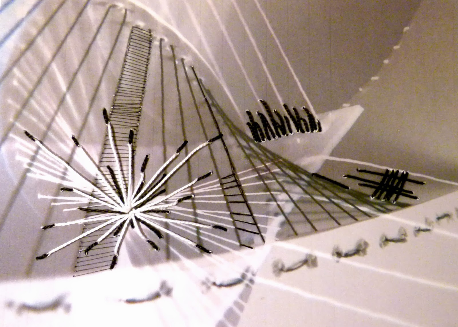
I stitched into them to create holes with the needle so I could take more blurred pictures using the light.


I thought the best results were the last 2 pictures as they started to look 3D and the colour of the background print really enhanced my work.
I also discovered that I love working in this way! Taking photos of my work and working back into them is something I've never really done before. I am looking forward to putting them back into photoshop and I like this cycle of constantly feeding my work back into itself. I will definitely be using this method again in other projects.
Monday, 28 October 2013
Photoshop: 3D stitch/light samples.
In order to get to grips with photoshop a bit more, I decided to use the photos that I had taken to layer up the lines created by the stitch and 3D samples. I was very happy with the results, and I liked layering up the different line qualities.


I also liked the contrasting circle shapes created by the light coming through the holes in the paper when I took the photos.


I have discovered through doing these samples that I love using photoshop as part of my practice. I don't know how to use it very well but I feel that when I feel more confident using it, it will really enhance my work, and allow me to mix processes really easily.
Group Tutorial - 28/10/2013
I felt that I came to this weeks tutorial with a lot to show, but I left feeling lost, as if I had so many directions and ideas but didn't know how to develop it and move it all forward. I feel like some of my strongest work has been my 3D, stitch and light samples this week, so I am planning to push this forward even more. To do this I have considered crossing over stitches, using printed card and reflective card, and playing more with photoshop and photography.
Colour is also something that I need to consider more when I'm working, as I need to be careful that I don't end up using just grey and orange. I think some of the sepia tones that are coming through in my photography might help me to refine my colour palette and experiment more with colour.
A big aspect that was brought up this week was thinking about what we want to produce as a final outcome for our project, such as a collection of prints, or an installation for an exhibtion. I am going to try and think about this more this week when doing my work. I also need to think about whether my work is going to be for fashion or interiors, and where within these markets I want to sit.
Colour is also something that I need to consider more when I'm working, as I need to be careful that I don't end up using just grey and orange. I think some of the sepia tones that are coming through in my photography might help me to refine my colour palette and experiment more with colour.
A big aspect that was brought up this week was thinking about what we want to produce as a final outcome for our project, such as a collection of prints, or an installation for an exhibtion. I am going to try and think about this more this week when doing my work. I also need to think about whether my work is going to be for fashion or interiors, and where within these markets I want to sit.
Sunday, 27 October 2013
Responding to instructions
After doing work last week based on giving people instructions to respond to, I decided to respond to the work this week and see which aspects of the work I enjoyed most. One example is shown below. I also did some drawings of other aspects of the experiments that I liked.


Responded to above drawing with handmade string stamp and black acrylic paint. I love the textural and tonal qualities of the result.


Saturday, 26 October 2013
Monoprinting
After doing so many workshops and learning new printing techniques, I felt as though I needed to have a go in the print room. I want to make sure that the work I am doing is relevant to my project so I decided that monoprinting would suit my work best, as I could paint anything I wanted onto a blank screen.
I am also keen to improve my overall printing skills and get used to the new print room, so that by 3rd Year I feel confident in doing this. As part of this I also want to get used to fabrics, and understand how I should use them in the print room, as in layering them up, and working out how many pulls to give the binder on different types of fabric.

The prints that I created were based on drawings from my sketchbook.

I wanted to try the line drawing print to see how much detail I could achieve with this technique. I thought it worked quite well but the line quality looked a bit like felt tip. It was still interesting to know that I could achieve detail with mono printing, without the dye smudging.

I created 6 prints in the print room, with 2 different designs, but I was only really happy with 2 or 3 of them. This is because of the fact that 2 fabrics were layered up (the underneath one didn't come through properly) but it was really useful to see how fabrics reacted, and to see how many prints I could get out of painting one screen.

I decided to embroider on top of one of the prints that I wasn't too pleased with, due to the dye not penetrating the fabric properly (as it was underneath another fabric). I thought the sharpness of the stitch contrasted well with the blurred, grainy quality of the print behind it.
I am also keen to improve my overall printing skills and get used to the new print room, so that by 3rd Year I feel confident in doing this. As part of this I also want to get used to fabrics, and understand how I should use them in the print room, as in layering them up, and working out how many pulls to give the binder on different types of fabric.

The prints that I created were based on drawings from my sketchbook.

I wanted to try the line drawing print to see how much detail I could achieve with this technique. I thought it worked quite well but the line quality looked a bit like felt tip. It was still interesting to know that I could achieve detail with mono printing, without the dye smudging.


Friday, 25 October 2013
Stitch: 3D samples
After creating my stitch samples last week, I felt like I needed to develop them further. I decided that the tight long stitches which i was using to replicate sound waves, could instead be suspended, by holding together card to create shapes.

I also tried to create an element of blurring in some of my photos to link in some other aspects of the project.

I thought the crossover of the straight threads created interesting geometric shapes.


For my last sample I decided to use a simple shape, but paint the threads with black ink in the shape of the song waves I have been working with from Piano Phase. I thought this was particularly effective when looking at the piece from an angle.

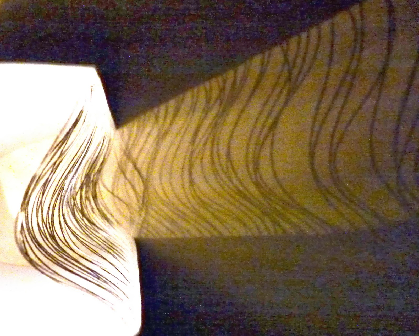
I thought that the stitches crossing over in my 3D samples might create some interesting shadows so (despite the camera quality) I decided to take some photos of the shadows I was creating. As well as casting shadows on the wall, I also cast them on the inside of the card to create this bent effect shown below.


Bending the card also made the yarn slack to create this wobbled effect. The black quality of the ink also showed up nicely in these images below when the light was shone on it.
Stitch: Blurring and Lighting
So far blurring has been a part of my work due to the dragging effecting created by the sound waves I discovered whilst using audacity, so I thought I would develop it further into my photography and photoshop. Here are some deliberately blurred images using the manual focus on my camera.


I used the sample that was stitched on paper to do these photos, in front of a light source to see what the blurring effect had on the holes of light.


For the sample above, the light source was the TV, and it was interesting to see the colours change.

I am really happy with the results, so the next step will be to work from them and put them into photoshop and work with them.
Monday, 21 October 2013
Group Tutorial - 21/10/2013
Todays group tutorial gave me lots of ways and ideas to push my work further, and it was a really useful session. One of the underlying questions that I had last week was about how I could develop all of my work further, especially the instruction based work I had been doing. After speaking to Alex I think the best solution is to start representing some of the results using stitch, and pick out the aspects of them that I like most to work with. I also thought that layering different drawings and images on top of each other on photoshop, and playing with layering and layout would be a good way to push my work further.
My stitch experiments were also a big part of last weeks work, and I plan to take these forward by trying to make them more sculptural, using the stitch to hold paper together. I also thought that when I had experimented with this, I could use paper with scanned images or prints on, and play around with the results.
I have also been growingly conscious about getting into the Print room and putting some ideas onto screens, but speaking to Alex has reassured me that the direction I am going in at the moment is fine. When I have looked at all of my work as a whole, I might consider putting some different lines onto a screen and layering them up (like people did in the Instruction experiments) but for this week I am going to try and see where the work can take me, without concentrating too much on the print room.
My stitch experiments were also a big part of last weeks work, and I plan to take these forward by trying to make them more sculptural, using the stitch to hold paper together. I also thought that when I had experimented with this, I could use paper with scanned images or prints on, and play around with the results.
I have also been growingly conscious about getting into the Print room and putting some ideas onto screens, but speaking to Alex has reassured me that the direction I am going in at the moment is fine. When I have looked at all of my work as a whole, I might consider putting some different lines onto a screen and layering them up (like people did in the Instruction experiments) but for this week I am going to try and see where the work can take me, without concentrating too much on the print room.
Friday, 18 October 2013
Photoshop Workshop.
At the start of this week I had a great photoshop workshop teaching me loads of great techniques about placing our designs and drawings onto the objects we want to see our designs on. I have spent a lot of time this week practicing what I learnt and playing around with different objects and drawings, for both interiors and fashion.


g.jpg)
g.jpg)


I thought the line drawings on these dresses were the most successful results.
g.jpg)
g.jpg)

I enjoyed this exercise, as I am still unsure about whether I want to do print for fashion or interiors. I have always preferred print for interiors but I found this exercise much more exciting (and with better results) when I was working with fashion garments.
Responding with Stitch.
After discovering the Audacity App I loved the results it produced and liked playing with its linear qualities. I thought it would relate well to stitch, so I did two samples, one on paper and one on fabric shown below.


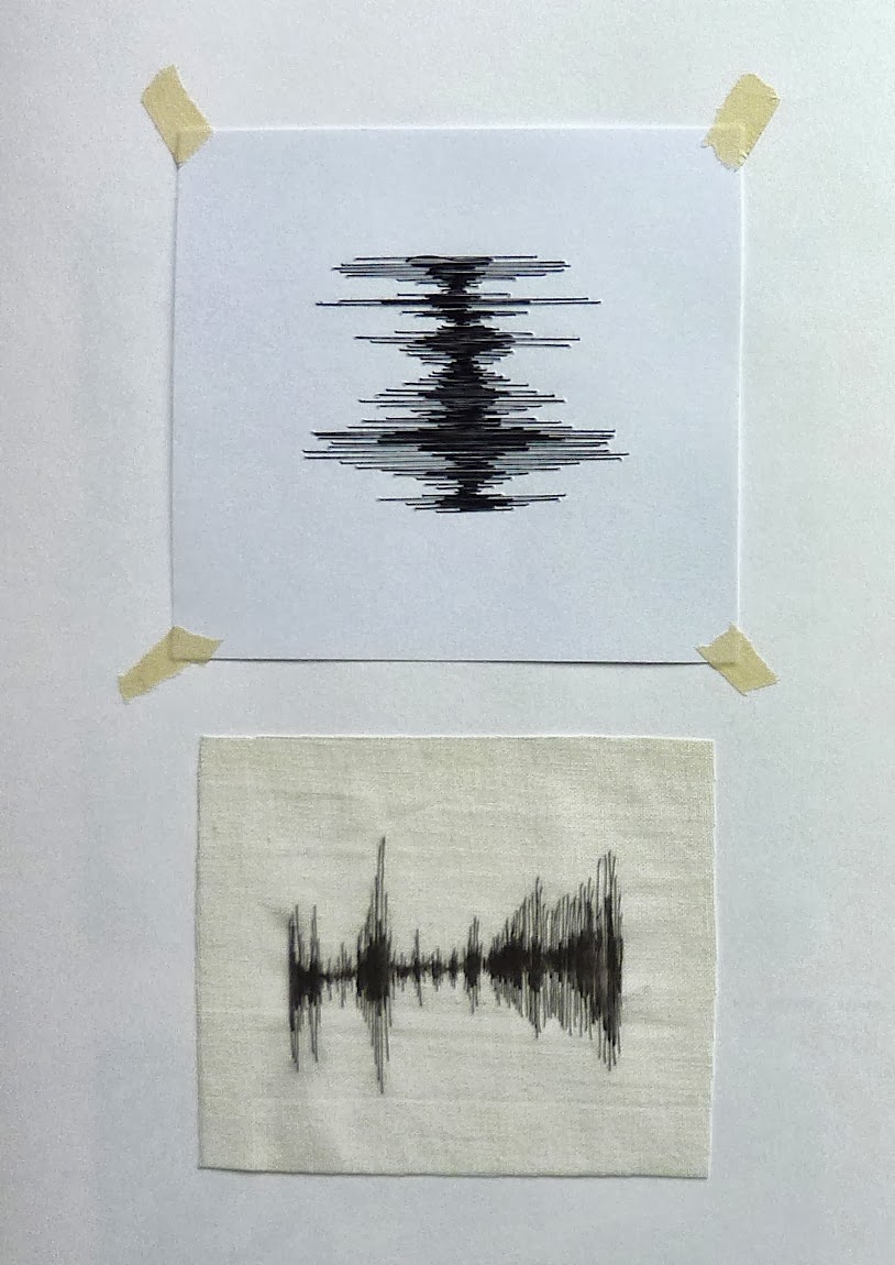
I liked the results of both, especially the paper experiment which let through light in a delicate way through the holes created by the needle.


I responded to these in various ways including drawings in my sketchbook, and a french knot embroidery sample, marking all of the holes that the light came through. I thought the drawings were successful and I would like to try and work with the results on photoshop.


Subscribe to:
Posts (Atom)