Tuesday, 30 June 2015

Manchester School of Art Degree Show 2015

A few weeks ago I set up my degree show, which was a fantastic opportunity to see all of my course's work come together, so I couldn't resist putting some of my favourite work on my blog.


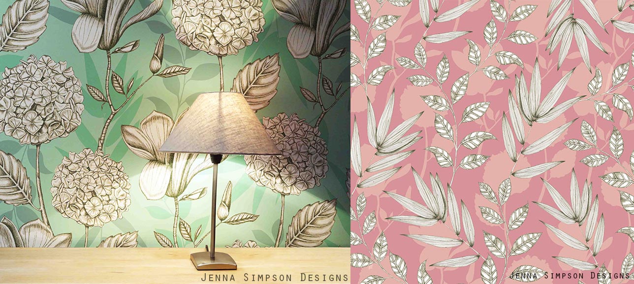
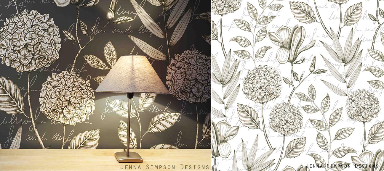
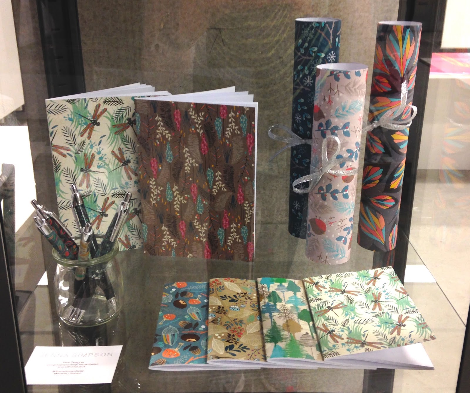
My display consisted of two wallpaper drops and a shelf in a cabinet with my surface pattern work in. I was also over the moon to receive the Digetex award for Interior Design from the degree show.

Whilst looking around the degree show, two printers work stood out to me in particular for their great use of colour and texture. Krista Murtagh (Left) used different painting techniques to create her work, and I love the final outcomes with a bright pastel colour scheme. Ellis Witherspoon (right) used digital drawing and manipulation techniques to create her fantastically bright, textured fashion prints.


The work of Annie Richardson (below) also really caught my eye because of the variety of textures and bright colours. Annie is inspired by surface manipulation which has resulted in a fantastic collection of samples that are tactile and very interesting.


The work of the weavers was so good that it made me want to get on a loom and give it a go myself! The work of Camilla Thomas (below) is gorgeous, with fantastic textured yarns, and a sensitive use of natural colours with flashes of reds and oranges.


Eden Blaber's weaves were very intricate, with a great use of colour. She also used metallic threads and beading to add an additional element.


As I am always drawn to natural things, it's no surprise that the work of the two students below inspired me. Chelsey Linley-Bradford uses hand drawn mark making as well as digital illustration to create gorgeous patterns on a variety of surfaces including wooden flooring. 


Kimberley Jones uses naturally dyed yarns and weaving techniques to create gorgeous jewellery pieces. I love her natural drawing style, as well as her use of colour.


The degree show made me very proud of everyone who is graduating from the Textiles in Practice course this year, and I am already looking forward to seeing the degree show next year.

Saturday, 9 May 2015

Unit Evaluation.

When I started Unit X, I set out clear aims:
  • Complete the Botany and Moments collections
  • Undertake a live brief
  • Enhance my online presence
  • Assemble a professional portfolio
  • Dedicate time to research printing/production methods for the degree show

I can confidently say that I have achieved everything I set out to complete, and I feel I have done this to a high standard whilst working to deadlines and managing my time well.

I knew from the start of the project that drawing elements for the Botany collection would take up a considerable number of weeks of the project, so by completing this first I allowed myself to plan the rest of the unit accordingly. This enabled me to undertake more research into 'moments of time' within nature, to draw upon within my Moments collection. I feel that both collections are completed to a high standard whilst showcasing the different styles I can achieve, along with good use of colour. Completing further market research has allowed me to refine my context, ensuring that my work is commercial, and suits the market that I intend for it to fit into. I believe that my work fits into each context because of the careful consideration of colour and scale: spending time creating high quality visualisations also allows other people to see how I envisage my work.

Creating a website and increasing my online presence has definitely been a strong aspect of this project for me. I have updated and created social media platforms such as Linkedin, Twitter and Instragram. I was also keen to create an online portfolio of some form and after researching into this I decided to create both a Behance account and a website, enabling members of the public, as well as companies and clients, access to my work.

Completing the live brief was another successful part of this project, as it allowed me to show how I can work slightly more abstractly. I also pushed myself in terms of colour and media, and drawing upon some of the research I completed in the previous unit was very beneficial. 

Putting together my portfolio has taken a lot of time but I feel that I now have a strong portfolio that I am proud to show and take to interviews. The way I have conducted my practice this year and last year has meant that I have a breadth of different styles to show, as well as the fact that I can work towards many different contexts including wallpaper, soft furnishings and stationery/giftwrap. Researching into how to present a textiles portfolio has been valuable to ensure that I presented work for different disciplines in the correct way.

I have also been actively job searching using my updated CV and new online portfolios. So far I have had a great response, including attending two interviews for textile designer positions; I am looking forward to seeing where my work will take me.

Monday, 4 May 2015

Preparing my portfolio

This week I have started to focus on getting my portfolio together. When assembling the whole portfolio, I have researched into the presentation of furnishing and surface pattern portfolios to make sure I adhere to industry standards. This includes factors such as including reference numbers on the back of designs, along with visualisations. However, furnishings differs from surface pattern in presentation, which is important for to me embrace as I have such a varied portfolio.

I have narrowed down the designs for the Moments collection, to create the final collection (shown below). I made the selection based on how the colour palette worked as a whole, whilst ensuring that each design represented a different moment, and no design used the same element as another so that they can be bought by clients.


I also felt that it was important to complete a gift wrap photoshoot to provide visualisations to include along side each design in my portfolio. After trying to complete this on photoshop using a blank present, I felt that the curves, angles and folds weren't realistic enough, so I styled a shoot with printed papers to achieve perfect results. 


I am happy with the final outcomes, as they look good in my portfolio next to my prints. They also compliment my website, as I took photos that can be used on the homepage (shown below). I ensured that the various wrapping accessories that I used (twine, rafia, natural objects) adhered with my theme and complimented the design I was photographing, enhancing the feel of the images. Having a visualisation next to my design will further ensure that my portfolio is professional and appropriate for my audience.


Testing foiling methods has been on ongoing research process throughout the unit. After finding a successful way to complete the foiling, it didn't work on the laser printed images because the glue beaded on the paper. I intend to refine this technique before the end of the unit. Alternatively, I could show a small swatch of the foiled design from an inkjet printer next to the full design from a laser printer.

I have also decided on the final designs for my Botany collection, which was difficult as I had numerous different designs that worked well, containing the same elements. However I am confident that this collection represents my concept well, whilst maintaining a strong colour palette, and mixing traditional and modern techniques together.


When presenting this collection, in order to work professionally, I need to include visuals and colour ways to suit the market I am designing for. I have dedicated a lot of time to ensure that the visuals show off my work in the best possible way, and the colour ways have a sensitive and complimentary palette. Below is an example of the information I am including on the back of each design: a visualisation, colour way, 2x2 repeat square and a reference number. 


I have also considered other practical features for my portfolio, including mounting each collection on heavy card to ensure that they are sturdy and won't crease. Testing has been completed for all of my collections to ensure that the final portfolio versions are printed to the correct scale, and I am happy with the colour and printing quality. I also intend to include a folder with boards showing the concept, research and context for each collection. 

Friday, 24 April 2015

Live Brief: Tigerprint: Mark Making

This month I decided to take part in the most recent Tigerprint competition which is based on Mark Making. I wanted to take the opportunity to use the natural theme that I have been working with within the brief of mark making. I therefore looked at textures and patterns found within nature, as well as using natural objects to make pattern. The idea of printing with natural objects and making my own tools to paint with was an idea that I left behind in the Practice unit, but now that it's relevant, I decided to pick it back up again.


I started off by collecting plants and natural objects that I could use to paint, or make tools with. I also observed natural patterns and textures to replicate with the tools, as shown below.


I enjoyed the challenge of completing a shorter project that allowed me to work with more abstract patterns, whilst picking up work I had left behind. After sampling with the mark making that I had completed, I selected a final collection of eight designs shown below. I decided to use two different colour ways, to show how I can use colour, whilst trying to cater to the brief, as I don't know what colours they are looking for.


I have submitted the designs with orange circles next to them, because they fit the brief, whilst all being different and suiting their context. The pastel stripes design (top left) was shortlisted, which I am pleased with because it shows that I was working well towards the breif. I also completed a photoshoot to show how I visualise these designs in the context of gift wrap.


Saturday, 18 April 2015

Creating Promotional Material . Preparing for Degree show .

Due to the fact that I am showing my work at the degree show and New Designers, I want to make sure that I have business cards and post cards to promote my work. After collecting many business cards from the degree show and the Northern Contemporary Craft Fair last year, I looked back at some of my favourite designs to get some inspiration.


I felt that the most effective business cards had a simple side with writing on (including website, and contact details), and a design on the opposite side. The most effective post cards contained a brief summary of the artist and their work on one side (and contact details), with a variety of designs on the opposite side. The post card allowed for a more complex design due to the size.

Below is the design for the postcard. I might change the designs I have chosen when my collections are finished, but I feel that the postcard will provide the reader with a sufficient amount of information about myself and my work.

Post Card Design

The smaller business cards contain less information but I feel that they are perfect for their purpose. I will print the same information on all of them, but include a variety of designs on the back so that people can chose their favourite design.

Business card designs

Along side this I have started to consider my display for both the degree show and New Designers. This has been harder than I expected because I want to display both my surface pattern and wallpaper collections. However because they are different styles with diffrent colour pallettes, I run the risk of making my space look cluttered and crowded. Showing both collections in some way is important to me, as I want to show the breadth of my practice, especially at New Designers, as various companies will be present.


I have therefore decided to use the idea above: hanging two bold wallpapers and having a small simple shelving unit to display a few stationery products. Placing the black and white design behind the stationery products should ensure that the colours don't clash, and bringing the product stand forward from the wall should separate the two a bit more. I will check whether I can use this method of display at New Designers, otherwise I will consider how I can adapt this idea.

Along side this I have also considered how I will produce my wallpaper and stationery products. I have therefore been researching different companies and collecting samples from them to check the quality and pricing. I have decided which companies I am using so I now need to liaise with them to ensure they can produce my products to the correct standard.

Thursday, 9 April 2015

Developing the Moments collection

After completing a large proportion of my Botanical collection, I have started working on my surface pattern collection.


As my surface pattern work is based on moments in time, I wanted to make a print based on the pond in my garden, as I have always been fascinated by the amount of plant and animal life that inhabit it.


Some of the nature that I drew from consisted of plants, frogspawn, duck weed, lily pads, frogs, dragonflies and iris petals. The designs above represent the pond in the way I envisaged, however the colour isn't perfect, and I feel that the designs below have more potential, due to the good use of colour and composition. The Iris design would add a variety to the collection so far, and the dragonfly design captures the pond perfectly, corresponding to my initial learning agreement.


After visiting the Lake district over the easter break I wanted to use this as inspiration for my Moments collection as well. Whilst I was there I took photos and sketched things that interested me.


After drawing motifs to design with, I started to assemble designs. I think that the design on the left is visually appealing, however the vertical stripe is too strong, and it's too simple. The design on the right also didn't fit the brief as it doesn't convey the Lake District, however I feel that this is because of the colour use.


 The design below was based on Grisedale forrest and I am happy with the result, as it portrays the layering of trees on the hills, with a good use of colour and line.


I also really like the design below based on a visit to Grassmere because of the composition and the fact that it represents my visit. It also suits the products I am designing for well.


The context for the Moments collection is the high end of the highstreet. I can see my products being sold in companies like Paperchase and Selfridges. More specifically, the context for my work is similar to that of Anna Emilia and Khristian Howell. They both create and design contemporary, quirky stationery that sells on their own sites and through companies on the High street, such as Waterstones and John Lewis. The price range for these products is therefore between £5-£20, and is of a very high standard and quality. I therefore feel that my work fits this market because of the style of design, colour use and quality of final product. Creating visuals and doing a photoshoot will allow me to portray this to others as well.

Anna Emilia . Khristian Howell

Tuesday, 31 March 2015

Developing the Botanical collection

I have been continuing to draw and paint images for my wallpaper collection for a large proportion of this unit, in order to meet the requirements of my learning agreement. As they take a long period of time to draw, I scan them in at different stages so that I have a large quantity of imagery to work with. This is illustrated below.


Due to the amount of time that these illustrations take, I plan out drawings before hand to ensure that I will be able to use them in a design. As well as creating the design I planned originally, I also designed other potential wallpapers, some of which are shown below.


The elements that I have been drawing over the past few weeks have been meadow plants, so I was keen to get across that feeling of delicate, yet cluttered flowers. I feel that the prints shown get across this feeling whilst staying contemporary. I think they also work well because of the contemporary composition and colour.


I also wanted to use the pencil sketches that I scanned in, and the traditional botanical writing. I feel that this is working well in the image below, as I have used the white, solid sketches to overlap the watercolour images, giving a contemporary twist to a traditionally inspired design.


I have also been creating more drawings using pen to draw with rather than pencil and watercolour.


I think the green background of the design above will fit into the rest of the collection well, but I am concerned that the style might not suit. I could therefore create other design that is similar to this to bring the rest of the collection together if this is the case.

I also tried to create a watercolour effect in the background of the design below. However I don't think the design is successful as part of the rest of my collection, as the style looks completely different.


I preferred the designs (below) which involved all four different plants that I drew as there is more to look at within the design. I also felt that adding text in the background helped my designs to link more to the rest of my collection. However, I felt that the white design would probably fit into the rest of my collection the most. This is due to the text in the background, but also because the images look less graphic as the background colour is the same white as the imagery.

My context for this collection is similar to that of companies such as Osborne and Little, Harlequin and in particular Marimekko. I feel that Marimekko's prints have an impact due to their size, and they also digitally print their wallpaper onto varying widths of paper, which is exactly what I intend to do with my designs. As well as selling through their own site they also stock companies like John Lewis. This production method and scale mean that their wallpapers are specialist, designer products, and this is why I think my work would fit into the same market. 

Marimekko

I am really pleased with the developments over the past few weeks. Although it has taken a long time to do the drawings, I feel that it has made my designs a very high standard. The only problem I will have is that I can only use an element in one design. It will therefore be hard to chose which design or designs to take forward for my final collection. As I am finding this decision hard, I might look back at it in a few weeks time, and might have to redraw some elements if I want to include the design in my final collection.

Friday, 20 March 2015

Creating a website.

A large part of this unit is about being professional and taking an entrepreneurial approach to our practice. As part of this I am keen to promote myself online, so that if people see my work at the degree show or New designers, they can see my whole portfolio. I have done this by creating a:
These are useful because they are used by professionals and make portfolio's and CV's easily accessible. The portfolio is a crucial element of these platforms, but I am aware of the need to protect my work online. Some designers watermark images to protect them, however I believe this can detract from the design. I therefore decided to attach 'Jenna Simpson Designs' to the bottom right corner of every image, as shown below, as well as making the images small and not including the full repeat. This makes the image easily traceable back to me, whilst meaning that it can't be copied.


I therefore added some of these images to my Linkedin account, and also updated it with my recent work, projects and experience. 

Linkedin Profile


In order to start making a website, I researched website building sites and other designers websites to see what they included and how they present their work. I noticed that some of them had certain aspects in common, such as pages for portfolio, about and contact. They also had links to various social media platforms such as Instagram, Pinterest and Linkedin. 


www.jessicawilde.co.uk


I took this on board by creating a social page, with Twitter, Instagram and Pinterest feeds (below). I also added a page for my blog, and a contact page so that anyone who is interested in my work can easily get hold of me. Social media links are also in the footer of every page.


Screen shot from my new website


Another feature that appealed to me was the promotional sliders on homepages containing imagery and information. I therefore created some to allow people to instantly see my work and make them want to look through the rest of my portfolio (below).


Screen shot from my new website

I also looked into Behance: an online portfolio site linked with Adobe, allowing easy access to professionals and jobs. I decided to create a profile to allow maximum exposure for my work, and I have added lots of information about myself such as work experience, as well as my portfolio.

https://www.behance.net/jennasimpson 


I believe that these platforms will allow a wider audience to see my work, and provide a finished, concise overview of my practice, rather than my blog which is a work in progress.

Monday, 23 February 2015

Unit X Launch

During Unit X I intend to complete both collections that I started in the practice unit, whilst undertaking a live brief and creating a strong, professional portfolio.

I believe that the Wallpaper collection, Botany, was developed very well within Practice, and feel that dedicating more time to drawing for this would be a good investment of time. I don't believe that the concept needs exploring any further as I developed it within the last unit to produce a good style and concept that worked well as a collection.

The surface pattern collection, Moments, was also developed to a good level within the Practice unit, however I want to make sure that I draw upon a variety of imagery and inspiration sources to ensure that each print in the collection is distinct. I therefore aim to dedicate time to gathering a variety of imagery from various places.

I also want to participate in a live brief, drawing upon research that I left behind in the last unit, and allowing me to continue the theme of nature throughout my portfolio in a slightly different way.

Throughout the unit, I will dedicate a considerable amount of time to research methods for printing and making products including stationery, wallpaper. and business cards. This includes researching into methods to foil my wrapping papers and liaising with companies regarding pricing and printing of products for the degree show.

To compliment these aims, I want to create a strong professional portfolio that is sensitive to the industries standards, as well as increasing my online presence to allow more people to see my work. This will include creating an online portfolio and updating and maintaining social media platforms that I am already on.

Thursday, 5 February 2015

Unit Evaluation

This unit has allowed me to explore every aspect of textiles that I love. I have been able to use and enhance my drawing skills within my Botany work to develop highly detailed wallpapers. I have also been able to develop my stylized drawing skills in the Moments collection. Using these elements digitally has also meant that I have learnt even more in Photoshop in Illustrator, especially putting images into repeat. I am glad that I have been able to cater for the surface pattern and wallpaper contexts as this is important for my portfolio when I graduate.


At the start of the unit I feel that I explored my concept very well, navigating lots of options for my theme. I continually pushed myself in many ways, including working very large scale, and working with abstract ideas. I chose my two favourite aspects of this research to develop into different collections. I feel the initial exploration allowed me to ensure that the two areas I developed furthest would give me enough material to work with, and it also ensured that I had a strong and interesting concept behind both collections.

I have also faced a few challenges during this project such as deciding which aspects of my research to carry on with and presenting my work during the review. Choosing which areas of research to not carry on with and develop was hard because I didn't want to risk missing a good idea, or choosing the wrong idea. Overall I am really pleased, as I feel my decisive decision making has lead to two potential collections that I am proud of, and that represent me as a designer. Also, having these two collections to work on meant that I was rarely stuck for inspiration. This can sometimes be an issue during projects, but if I felt stuck with one collection, I could switch to the other one and eventually I would be back on track with both.

At the start of the project I aimed to improve my colour work and I also feel that I have achieved this. Both colour palettes that I used for this unit I haven’t used before, and I am pleased with the results, as it has made me more confident with colour.


Undertaking work experience at Tigerprint and completing a brief for them has also been extremely rewarding, giving me an idea of how designers work to real briefs. I also had the chance to push myself by working towards a fathers day collection, which isn't my usual floral, feminine style. Entering my work into other competitions has also allowed me to become more professional, as my work has been seen by the general public amongst work of other textile designers.

Overall I am confident with the work I have produced and am excited to use this as a starting point for Unit X. I intend to develop both collections to make two collections of at least 8 designs. I might also develop a Christmas wrap collection along side this. I have conducted initial product research to allow me to continue this in Unit X, so I can find the best way to print and make products for the degree show.

Tuesday, 3 February 2015

Developing Surface Pattern designs

This week I have had the opportunity to develop my surface pattern designs further along side visualisations.


I am really pleased with some of these prints as I feel the scale is working well, along with the colour and content. Although I was worried that my concept was hard to explain and get across in a print, I feel that these prints are successfully representing data. To enhance this idea, I have named individual designs with the moment that the data was taken, such as winter woodland.


When starting to look at the prints together, I started to notice that certain elements stood out from the rest of the collection, for example the typography in the print above. I do like the typography but in Unit X I might consider adding it into more than one design so it works well over the whole collection.


I also spent time this week taking photos of objects for visualisations to help bring my products to life. I am happy with these but in Unit X I feel I could produce stronger images that set more of a scene. For example a set of stationery, or a pile of presents.


I also started to see that some prints (e.g. above) have the potential to develop into a christmas collection in Unit X. I feel that this would also be good for my portfolio, showing I can work to realistic breifs.

Tuesday, 27 January 2015

Surface pattern designing

This week I have been getting back into designing for the surface pattern part of my project. I decided when I divided my work that I wanted to work with data for the surface pattern aspect of my project. After having a break whilst working on my botany work, I now know that I want my prints to represent the data I have collected from a specific moment in time.  After looking at how other people represent and collect data, I realised that I didn't want my prints to look like mathematic data as it wouldnt suit my target market, which led me to the idea of making my print a way of representing data, or a moment in time. I am therefore going to collect or draw items at different times and locations, and turn these into prints.

I had already been doing this sort of data collection throughout the project, but this week I took the opportunity to document more objects around me. I started at the bus stop that I use to get to university, and also went on a woodland walk. These have produced good drawings but I feel that in the next unit I can gather more data using more varied locations. This will also end up producing more interesting prints.


When I placed these motifs into photoshop I created a number of prints to allow me to experiment with the motifs to their full potential. This resulted in producing more than one print that had the potential to be a final design with the same elements (shown above). Therefore in Unit X I could recreate a similar print after drawing new motifs.


Next week I want to create more prints with different elements so I can see how the collection might function as a whole. I feel that to enable me to see which prints are working best, I need to take some photos for visualisations, which I will complete next week.