Monday, 26 January 2015

Designing Botanical Wallpapers

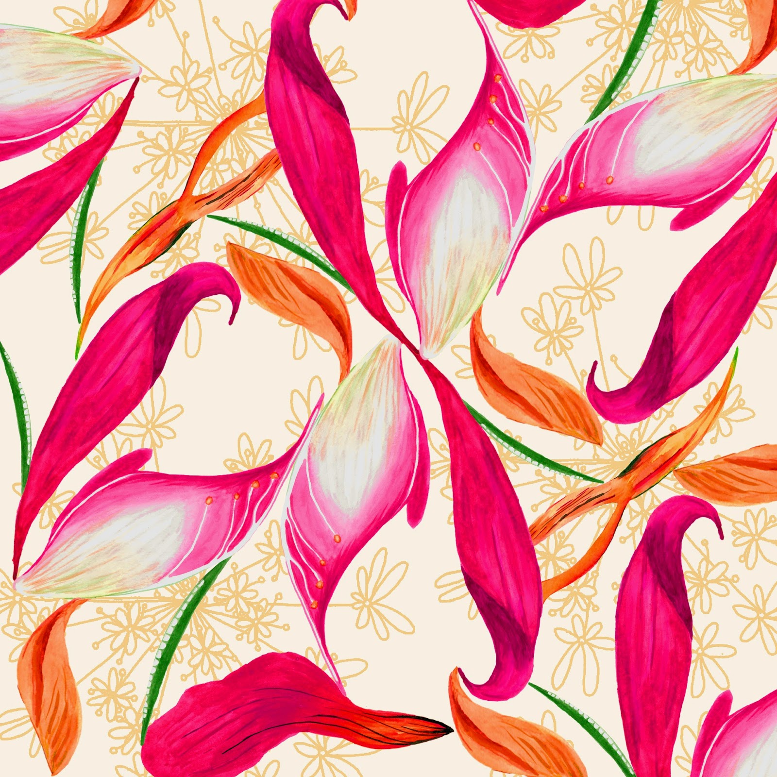
After spending two weeks creating detailed botanical drawings I had enough material to create designs this week which are shown below.


When I started to assemble designs, I soon realised that scanning in my drawings at the pencil stage and the watercolour stage was really useful for the design process as it allowed me to build up layers of line and solid imagery. I feel that the different styles of layout, from organised to scattered are working well and are giving a breadth to my collection. I also used many drawings of the same plant to create more detailed prints including buds, stems, cross sections of various parts of the plant and writing (as is used in traditional botany illustrations). I also feel that the context and layout of these prints reflects my concept really well.


Some designs were simpler with just two colours, and the Echinacea design above worked really well, as it also had a linear quality that would work well for wallpaper. I feel this contrast could add a nice variety to my collection.


Creating visuals as I designed helped me to see how the scale of my designs were working and also gave me more inspiration for other designs. I now feel that the way I am working to create my designs is working really well for me. For future designing, I will bear in mind that plants with flowers produced better prints, due to the different qualities to the drawing such as colour and shape.

Monday, 19 January 2015

Botanical Drawings

I have spent the past two weeks dedicating a lot of time to drawings for my wallpaper designs. I know that in order to create high quality wallpaper designs, I need to produce large scale, detailed botanical drawings to work with, so I have managed my time well to accommodate for this.


After my research and experimentation based on botanical drawings, I now have mastered the technique for creating these illustrations. I start off by creating a detailed pencil drawing like the fern above, and then go over it with detailed watercolour as shown in the foxglove image below. This technique has worked well for me as it recreates the botanical illustrative techniques really well, and creates high quality drawings.


When choosing my subject matter to draw from, I have also been considering my initial concept, science and nature. I am keen for the plants I draw to have a scientific relevance, for example, the foxglove has medical properties such as curing heart disease. However if consumed in its raw state its also poisonous.

I feel that using a long period of time to do these drawings was a good use of time management, and will allow me to produce high quality drawings that reflect my concept really well.

Tuesday, 6 January 2015

Engaging with the outside world: Applying for graduate jobs

I am aware that at this time of year, many graduate jobs are available to apply for which start in September. I have therefore been looking for any relevant jobs within the design industry. I have contacted these companies with applications, which involved adapting and updating my CV, as well as creating a cover letter and answering application questions.

One of the applications that has developed the furthest so far is for the Hallmark Commercial Graduate scheme. I progressed to the fourth out of five recruitment processes which I am very proud of. This involved a telephone interview, online non-verbal and verbal reasoning tests, and a video interview. Experiencing this variety of recruitment processes has been a fantastic experience which will help me when applying to other jobs in the future.

I have also signed up for email notifications for various companies and job sites, in order to give me the best opportunity possible of getting a job when I graduate. I have also updated my linkedin profile in order to make myself a more employable person.

Tuesday, 30 December 2014

Ginger Squiggles Crafts

As part of my work this year I have developed my own bespoke craft business called Ginger Squiggles Crafts, as an opportunity to sell products which I have made and designed. I have learnt a lot about the business world, and how to sell and promote my products, which will be useful if I want to sell designs, or surface pattern products when I graduate. (www.facebook.com/gingersquigglescrafts)


I design all of my bespoke cards which has allowed me to work closely to customer briefs and consider commercial aspects such as pricing and time scales, which are crucial when designing in the real world. I have also had to consider my online presence, on platforms such as Facebook, Instagram and Twitter, as this is how all of my customers find me. This involves taking good photographs, as my customers don't see the product in person when purchasing, and updating these sites regularly. I also need to make it easy for customers to see the service that I offer, as well as the pricing of the products. I feel that this is working well as I already have almost 2,500 likes on Facebook and am making a good profit after being set up for over 6 months.


Another part of this business involves working towards trends and future events. I therefore work months in advance to design christmas cards, and valentines day cards, to meet customers needs. This has also taught me a lot about customers, as when designing cards, I am designing for two customers: the person buying the card, and the person receiving the card.


I am hoping that this experience will help me to sell my own textiles and surface pattern products when I graduate, as I am considering stocking my products in shops and markets, as well as on other online platforms as well.

Tuesday, 23 December 2014

Practising repeat in Illustrator

My main aim this week was to create a selection of wallpaper repeats based on the drawings I completed last week. After having a workshop based on repeat in Illustrator I also wanted to get to grips with how this works, as its a large part of my learning agreement, and I believe it is a very important skill to learn. 

To make it easier when learning more about the technique, I looked at a design I created a few weeks ago, and tried to replicate this in repeat. I encountered many problems, such as file sizes being too large, and the normal hiccups when using Illustrator when you're not used to it, such as how different the interface is from Photoshop, and rasterising and tracing images. However I feel that the design below is starting to look like a successful repeat.


After getting to grips with the process I felt confident in trying to create new patterns using the elements I created last week. As mentioned in the last post I wanted to create designs that resembled the botanical nature of my research, and I feel the print below achieves this due to the writing and layout of the flowers. I chose to use writing that wasn't actually a word so that it didn't detract or distract from the design itself and I feel this is working well.


I also changed the backgrounds to involve patterns such as the example below. I really like how this example turned out as I feel the colour is working well, as well as the scale (taking the time to make a visualisation helped me with this). I am concerned that the colours aren't looking like the palette I created for the collection, but as I like the designs I will see how the rest of them develop and consider whether to change my palette at a later date.


Now that we have finished for christmas, I will probably work on some surface pattern ideas and designs over the break to bring back in January.

Tuesday, 16 December 2014

Botanical wallpaper drawings

After last weeks tutorial I realised that it's okay to commit time to completing complex large scale drawings. After developing my mood boards last week, I wanted to spend this week developing some drawings for my wallpaper collection.

I drew 4 flowers on A2 sheets of paper using methods I used when researching botanical drawings (pencil and watercolour). The type of flowers that I drew also linked back to the science part of my brief as each flower had medicinal benefits, such as the echinacea treating cold and flu. I drew them with the intension of putting them together into one arrangement, however in the future I might consider drawing leaves, flowers and stems separately to assemble on the computer to allow my drawings to be even more flexible.


The drawings took up most of my time this week, however I did have time to arrange them into a half drop repeat shown below. I think that the colour is working well, and I am also pleased that I managed to create a good repeat.


Although I like the result, and I could see it working well as a wallpaper, I feel that playing with different backgrounds could add another element to it. I also want to try arranging the elements in a more botanical way, possibly incorporating writing like traditional botanical drawings.

To help with designing my wallpapers I also created a few boards of wallpaper research and contextual research (one is shown below). These have allowed me to focus my attention on specifically who I am designing for, and I feel the next stage of designing and drawing will be even more focused.

Tuesday, 9 December 2014

Pin up: Dividing work into two collections

This week I had a pin up of all my work to divide it into two collections. I found this hard, as my work could be divided in so many ways, for example visually or conceptually. I decided that the best way to do this would be to select around 6 pieces of work that would be the starting point for each collection. I then created inspirational boards based on this selection.


Above is the inspiration board for my surface pattern collection, consisting of current work. I picked the work based on the quality of drawing (small scale, linear and painterly) and the concept behind the work. All of the work above is based on data collection so I will use this and the work I have done so far to drive my designs. However, after doing work based on data such as pie charts, I know that I do not want my work to look like mathematic data because it will not suit my market. I will therefore be inspired by collecting my own material and making prints that represent a moment in time. Therefore the print will be my way of representing data.


I also created a board of surface pattern designs that inspire me. I wanted to look at how different artists and designers assemble their designs, including all over prints, motif based prints, and single or multi directional prints.


This is my concept board for my wallpaper collection, where I chose work based on botanical drawings. The concept for this collection will be based on anatomy and botany, which are two aspects of my research that I really enjoyed working with.


I also conducted some market research and created an inspiration board for the wallpaper collection, looking at how designers assemble repeats, and how they use all over pattern structures, as well as motifs, in their designing process.

I am really pleased with the starting points for each collection. I feel that I now can develop my work in a more refined way, using the best parts of my research to inspire my collections. I have also tried to incorporate as much of my initial research as I can, whilst being selective about which bits would work best. At the moment I am unsure about the name of each collection, and the colour palette that I will end up working with, but I am allowing for the fact that this will develop with the project.


Tuesday, 2 December 2014

Engaging with the wider design world.

When graduating University I want to make sure I am in the best position possible to gain a job in my desired field of work. At the moment I would like to be a surface pattern designer, and I am also looking at Graduate schemes.

A lot of Graduate schemes are receiving applications now, so this week I have concentrated on updating my CV with my work experience from over summer, and finding schemes to apply for. I have also taken careful consideration when answering online application questions.

As well as directly applying for jobs, I am engaging with the design industry by actively taking part in competitions and putting my work out there. I took part in the Ohh Deer Pillow fight, by submitting four of my most recent designs. They were uploaded onto the site, and sold for a short period of time! They can be found at http://ohhdeer.com/competition#compartist=766 and below is a screen shot of the cushions I uploaded.
Screen shot of my designs on the Ohh Deer website

I have frequently taken part in Tigerprint competitions too, and I uploaded some designs onto the Christmas Wrap Brief. I felt that these designs took a modern approach to christmas and the winter season, however they weren't specifically designed for the brief.


I would love to take part in more Tigerprint competitions, and when the next brief is released, I will consider making a few designs specifically for entry to the competition, aside from the rest of my work.


Tuesday, 25 November 2014

Responding from what I learnt during Review week.

Putting together the presentation for last weeks review helped me to see which parts of my practice I enjoyed the most, and made me realise what I need to do before the end of the project. This week I have therefore been doing more development drawings based on the work I have done so far.

The anatomy part of my project has really inspired me ever since I did it, and I also enjoyed producing more abstract work a few weeks ago so I decided to mix the two together. I therefore produced abstract paintings of the cross sections of my own flowers. Overall I didn't like the paintings as I felt they looked childish, but when photographing sections of my work, I realised that they became more abstract and more focus was on the marks an brush strokes rather than the overall painting.


I also thought that my prints were working well, and the idea of creating a print out of lots of elements from one flower worked well along side my learning agreement. I therefore created new work based on a Lily, using the parts to make marks, drawing it, and using the pollen to paint with.


When painting with pollen, I added a little water to make it a liquid but it turned into a really sticky substance that ruined everything that I was using, and was really hard to work with. I think the idea of using pollen could develop further into possibly printing techniques such as screen printing. However I will need to try it out when mixing with manutex, as it might not work at all. This might be a task for after Christmas or in Unit X. I also intend to make these into prints made from just Lily's.

The review also made me realise that I need to try different compositions for my prints, possibly linking them more to the research I completed at the start of the project.

Tuesday, 18 November 2014

Review Week

This week was review week, and we had to present our work so far in powerpoint form to two tutors and a group of our peers. I used the opportunity to reflect on the work I have done so far and see what parts of my work need more research or more development.

A key part of the presentation was establishing our context. My work for this project is for a surface pattern context, and I am considering four main product areas; wallpaper, stationery, giftware, and soft furnishings. At the moment I can see these dividing into two collections, of a larger scale and smaller scale. The decision to do this has been inspired by my two placements at Tigerprint and Digetex, as well as some key contextual influences.

Rachael Taylor is a surface pattern designer who designs for a large range of products including lamp shades, duvets, throws, cushions and wallpaper. As well as being inspired by her work contextually, I also love her drawing style as it stays hand drawn and quirky.

(Images from Rachael Taylor Designs)

As well as being inspired by designer makers, larger companies like Paperchase also inspire my practice as they have ranges of patterns that are produced across a variety of products such as gift wrap and stationery.

(Images from Paperchase.com)

Compared to Rachael Taylor, they have much lower prices as they are a high street brand. At the moment I am not sure whether my work will be aimed at high end or high street products

As well as examining my context, I also visited a Close up Exhibition at MOSI. It consisted of microscopic images of natural forms which I thought would give a good twist on the work I am doing at the moment.

Image from Come Closer Exhibiton

The geometric nature of these images lead me to think about butterfly wings, and other geometric shapes found within nature. I therefore gathered some first hand research at a zoo and completed some drawings of the patterns, with the intension to mix these patterns with some watercolour based paintings at a later date.


Tuesday, 11 November 2014

Design Experimentation and Development


For me, this week was all about developing the drawings I have been doing into ideas and designs. Sometimes this was just placing different elements together to see what they looked like, and some developed into design ideas.

I started off by defining my colour palette which is inspired by natural and scientific elements, as well as colours that I like. I have enjoyed working with the colour palette but to improve it, I feel that I need two different palettes or colour directions for me to experiment with (such as bright and tonal). I will bare this in mind when working on drawings and designs in the future.
Colour Palette Development

I started by experimenting with some of the large scale shadow drawings that I have completed, and I like the design below as there is a good contrast between line and shadow. I also like the fact that it involves the shadow and contour line drawing of the same plant, so both elements have come from the same source yet look totally different. However, I after using the larger scale shadow work in my designs, I dont feel it does justice to my concept and the ideas I have had throughout the project. I therefore might use the data ring idea with other elements to make a stronger print: the larger scale work might be something I could pick up again in Unit X.

Shadow and contour line print experiment

I also mixed up some painted elements to create a traditional style print with a modern twist. I like how each element works well together, with the paler silhouette in the background, and the bold flowers. I think if I created more similar, but smaller motifs, they would all make a good repeat pattern too.

Experiment with gouache flowers

I also wanted to keep some prints simpler, using just a few colours, and I am pleased with the print below. I like that this print represents the taxonomy, and data collection part of my project, as all of the elements were collected on the same walk. I think I could experiment more with the way I arrange these, possibly bringing in the botany element from my work so far. 

Print based on collection of natural elements

Finally, I also like these two prints below because I feel that they are starting to become more original and different to whats already out there. I feel that the mix of hand drawn, graphic, textural and solid colour work well together and I wish to develop this with my next set of designs too.


I am really pleased with my design development and I feel that this will now help me to focus my drawings as I know the kind of designs I want to create. 

Tuesday, 4 November 2014

Tree ring data and going even bigger!

This week my main focus was to go even bigger scale than I did the week before with my shadow drawings.

I created paper that was up to 1.5 metres by 1.5 metres and pinned them up on the wall for me to draw on. The way I chose what I was drawing linked back to my original brief based on data collection, as I went and collected 5 objects from my garden that had 2 colours in the leaves. Using these I then created my own experiments in 10 minutes using a variety of tools and media.

I am not sure whether I like the results as I feel the paintings look rushed and bad quality rather than loose. However my favourite painting is the one below, because I like the way the two colours of paint mixed whilst I was painting.

Large scale shadow painting experiment.

Another task I set myself this week was to look at ways that data is found and recorded in nature. I came across tree rings which hold a variety of data for each half year of a trees life, meaning scientists can look back into the past to find out what weather conditions, and various other factors, were like years ago. After doing tree ring drawings I decided to make concentric circles inside and outside of the outline of a plant. I thought these were effective and have the potential to be part of a design.

Concentric tree ring data drawings

I then combined these two ideas: paint mixing on the surface, and tree ring data. I also wanted to illustrate both the inside and outside of a tree, so used the mixed paint to represent bark patterns, and added the line to illustrate the tree rings on the inside.

Tree ring, bark and mixing paint.

I felt that this small painting was quite successful as it got across both elements and I like the contrast between line and mixed paint. I have also realised that I am at the stage where I need to establish a few colour palettes to work with so that I can start to develop my work with colour. However, I feel that this style of work wouldn't suit my target market based on the research I have done, so this more abstract style might be something that I could pick up on in Unit X.

This week has also shown me that I should look over my learning agreement again. I stated that I wanted to look into science and nature, but now I have realised that it is data, rather than science, that I am interested in investigating. I intend to edit this next week.